Peter & Paul from Sheffield came in today to brief us on the End of Year LCA show Identity.
I’ve teamed up with
Alex, because we both get on well and haven't previously worked together before, we thought it would be interesting to see what we could produce. We both thought it was a good idea to keep it down to just two people for this project. Me and finney
started by playing with different words and ideas, mainly thinking about what design studios, students, and how the general public would want when seeing the
branding for our end of year show.
Image
New
Good
Contemporary
Foundations
Principles
Individuality
Exciting
Different
State of Being
Story
Depth
Concept
Aesthetic
Trends
Against the
Herd
Separate
Opposite
Oil + water
Twins
Pairs
Pushing
Augment
Specialisms
Different
Light
Lighting Up
Colour
Highlight
Projection
Movement
Finding Things
The words that stood out to us so far were Separate and Movement because they can both be visualised so easily. We both suggested that oil and water could be used to represent 'Seperate'. Another concept that came to mind whilst brainstorming these words was to use broken objects that were cut in half and focus on the insides of said objects, as they could be made up of something totally different. For example, a Television could be filled with gold or silver inside. We were not sure how we would of been able to achieve this, but it was just an idea.
We started doing some brief visual research into the branding used on the past LCA end of year show. We quickly realised that all successful branding concepts used very strong, bold and simple sans serif type faces. Getting the type right is a major element for this brief, because it needs to be eye catching, easily legible and over all be appealing.


I sat down with Alex once again and
worked through some ideas for the final end of year show branding brief. We went through various examples of imagery for our 'Separate' idea and we kept returning to
'cutting things in half' such as laptops, fruit etc.

This idea seemed too over the top, therefore we moved onto thinking of more examples that can visualise 'separate'.
Myself and Finney had come up with an idea for a series called Details, which is concept a concept that focuses on imagery and could involve microscopic or magnified pieces of work from across different disciplines of the college. This concept was something that felt could connect all creative departments in college and could lead to some innovative imagery. Details also suggests a thorough development processes behind the work at LCA and ignores the fancy final outcome of work. Its a good idea because it is focused on the processes and textures in work, making us look closer at how much thought goes into the work.

Some of the visual ideas we had involved circuit boards, Alex mocked this
scanned circuit board up with some simple type.
For ourselves to help visualise this concept we needed to obtain work from students at LCA. Therefore we both went out around college and scouted for various pieces of work. We headed to printed textiles and illustration to see if we could take photos of work of have it scanned into a computer, so we could have a high quality file that could be enlarged, enabling us to look closer at the work and give us more freedom with the images when designing layouts.
Theo from Printed
Textiles works with concrete and wood, he had some really amazing textures that were created through experiments using different materials.
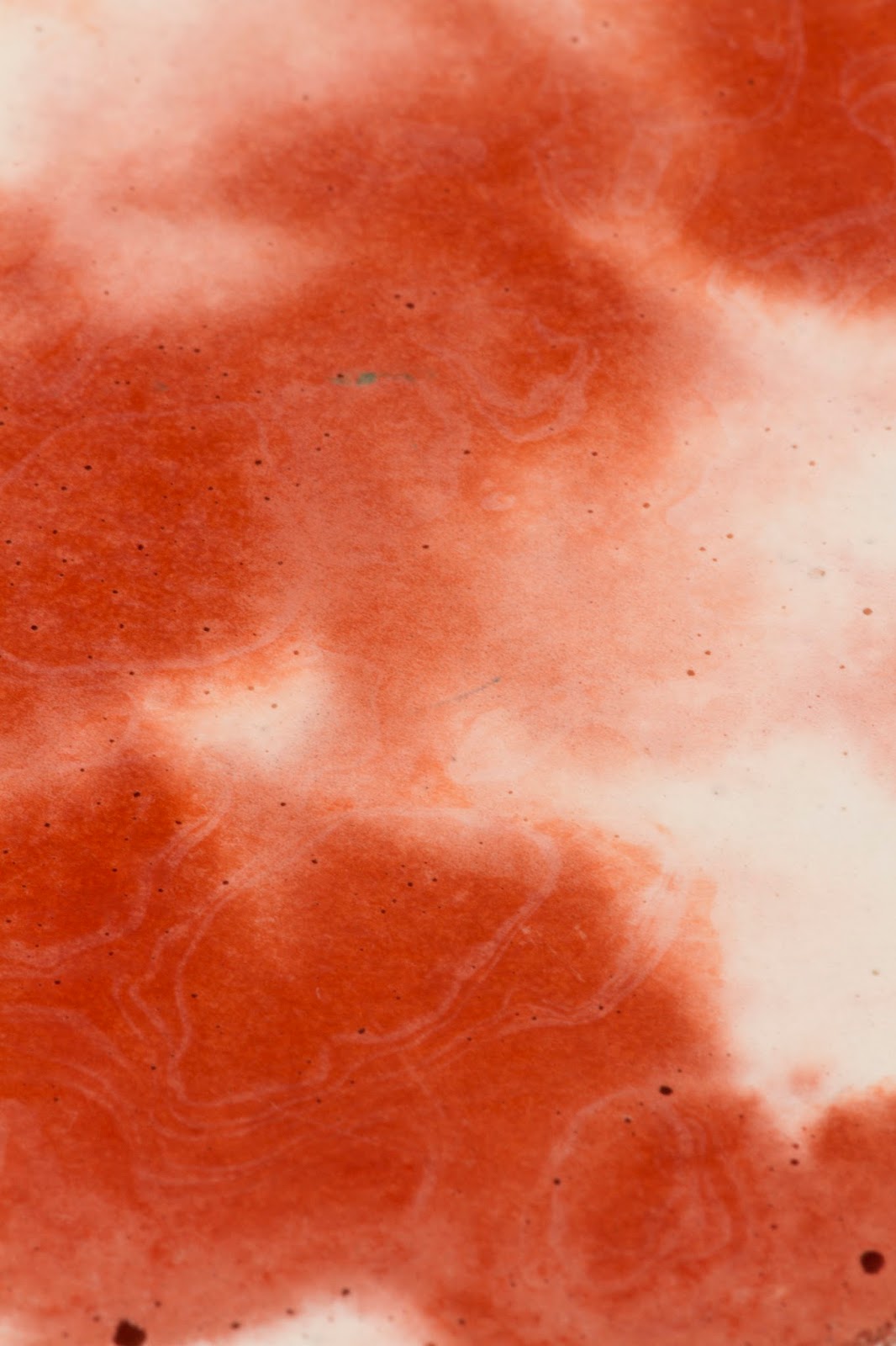


Joe Boyd's half tone dot screen-prints were bright and vivid and we saw the potential of cropping into details within the prints:


Jonny Pell creates really appealing blends/gradients of colours when screenprinting, this design is very modern/contemporary in comparison to the other materials/textures we obtained, therefore we felt that it might not flow well with our design development because it could look very out of place.


So after we had decided obtain really strong imagery from around collage and to not use the ‘Details’ title, we both began thinking of new names. Our new name had to link in with the concept of viewing work up close. After discussing potentially words and phrases we landed on using Depth, which is a much more subtle word than Details. We switched it to In Depth because Depth was far too vague, Me and Finney were confident in using this phrase for our concept because we both felt that it could be implemented in a real end of year show scenario.
The visuals below show us working out compositions and using the wealth of imagery we came across from around the college. We initially used the imagery within confined small spaces (with lots of white space) in order to provoke some kind of ‘deep viewing’ of each piece, reflecting the depth of the exhibition. We also played with typography and layout, seeing how different type connoted different personalities and tones of voice. Eventually we settled on lowercase Madras, which is calm and open.


We then started doing more experimentations with the images and decided to make them full bleed. Different type layouts were then used on top of these full bleed images along with the LCA logo.
We really liked using the same font size for name, sub title and date because it really stood out. Me and finney decided to keep going with this format of white Madras text on top of cropped full bleed art imagery. We decided to start whittling down the different layouts and images. Since we had got a hold of various work, we didn't want to create a single poster design, we wanted it to be a series of different posters that featured really detailed work.


Our PDF Proposal


The final outcome of this project has been quite successful in that we met all of our initial targets, which was to involve student work from different disciplines in college and represent it into our designs. The overall design aesthetic of the completed work is
clean, modern and eye catching due to the simple use of full bleed imagery and white typography. Our final advertisements would also work well if used in public because their large bold type is easily readable from a good distance away. The concept of making people look closer at LCA's work was also achieved through careful curation of work. Theo’s surface pattern textures worked really
well in this context because of all the intricate details that were featured on his materials, which provided as an effective background for the typography to be placed upon. Ailish's experimental fruit prints were also very effective in provided a strong contrast between the chosen Madras typeface.
I feel that a lot more experimentation could of been done to further improve our concept and design ideas, however we only had a limited amount of time before we had to send out our pdf's for Peter & Paul to view. Unfortunately we didn't get through to the next stage of developing the end of year show idea further.
The varied imagery works well across both print
and screen, as it enables us with moving GIFS that can flick between work and allows the imagery to be scaled up to size A0 because they were scanned at very high resolutions, allowing for them to be displayed on pasteboards around Leeds.
In conclusion, whilst it wasn’t perfectly
executed and worded, In Depth is an exciting and vibrant end of year show
concept which portrays the University and the work within it in a very
favourable light.


No comments:
Post a Comment