I decided to give Secret 7 another go this year for the third year in a row, the main reason being that it’s a music related brief and music orientated design is something I’m very interested in. I have been able to get my designs into the exhibition for the past 2 years. The objective of Secret 7 is to create a design for a 7 inch record sleeve that gets put on sale on Record Store Day. The designs must not include the artist’s name or the song title, hence the name Secret 7.
I decided not to pick Tame Impala and Etta James as I felt that they would be ones that most people would submit artwork for. The only musician to stand out to me was Max Richter because I had never heard of him prior to this and that his track was 8 minutes long. I loved how neutral it was in comparison to the other tracks, because of this it gave me a greater sense of creative freedom. It’s also the first piece of music to be featured on Secret 7 with out any lyrics.
THE RULES
- Dimensions should be 184mm x 184mm, with a 3mm bleed all the way around. That’s 190mm x 190mm in total. The bleed won’t be visible, so bear that in mind
- Your file must be produced in CMYK so it’s set-up to be printed. Any PMS specials will be converted. Metallic or fluorescent inks cannot be reproduced
- Your file must be 300dpi
- Your file must be saved as either a Tiff, JPEG or PDF
- Do try and reduce the size of your file as much as possible - 10 MB maximum
- You can submit a sleeve design for as many of our tracks as you like, and more than one for each track
- You must have until 23:59 GMT on 2 March 2016 to upload your designs.
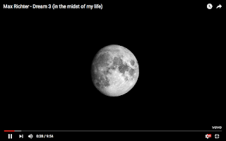
After choosing to design my artwork for Max Richter’s ‘Dream 3’, I did some initial research into his album and tracks. I quickly noticed a theme across the album, since it was named ‘sleep’ and that all the tracks had been named ‘Dream 1’ & ‘Dream 2’ etc. The video for the featured track is filmed in monochrome and features the moon throughout it, which gave me the idea of wanting to incorporate 3D spherical objects to represent moons or planets.
I decided to incorporate 3D shapes because they create an interesting depth to work, especially when in contrast to other elements.
Max Richter’s album emits a monochromatic tone because of the lack of colour, therefore I wanted to experiment with black & white in the design process. However, colour gradients were another element I aimed to incorporate into the design because I imagined it working well with 3 Dimensional shapes.

DESIGN RESEARCH
I had a clear idea in my head for what I wanted to achieve with the design. 3D objects and gradients were the main design elements that I knew were going to be present. These are some of the images I researched to help engrain in my mind what I wanted to create. Researching into different designs involving spheres and colour gradients gave me the idea to add a twist to the spheres. A lot of work I came across already consisted of simple 3D objects overlaid on top of flat colours. It became very mundane, therefore I planned to distort the shapes I created. This approach also fitted my overall design style as my process usually includes different method s of distortion or glitches.
DEVELOPMENT
Cinema 4d is the software I used for replicating spherical shapes. To be able to create spheres, I had to select the blue cube shape icon and then click onto sphere. This then placed a sphere into the composition. My plan was to distort the spherical shapes too, therefore I needed to select the other dark blue icon and then click displacer. This function allows for any object to be distorted in various ways. After dropping the displacer function onto my sphere, in the side panel I was able to start experimenting by using the different shaders that are featured.
After trying out the shaders I then shortlisted several of them because I found them to be the most effective. These shaders were Sparse convolution, Box Noise, Displaced Turbulence and Cell Voronoi. All of them made the sphere look melted, except for Cell Voronoi which presented a block like effect.
Once I had stuck to these manipulations I discovered that I could make half of the sphere appear smooth and the other half manipulated by raising the displacer upwards and selecting the direction of the displacer to ‘Spherical’. I did this because it put more emphasis on the distortion and I loved how it looked. As Max Richter’s album cover features the moon I decided to wrap an image of the moon around a sphere using the material editor. However it didn’t work out very well, I didn’t like how it looked at all. The next step was to choose colours and materials.
Cinema 4D has a range of preset colours and materials. I played with many of them and tweaked the ones I liked. After using a white material I discovered that it was too shiny and reflective, therefore I reduced the reflection on the material editor and enabled it to appear as a matte colour. I did the same with the black material too because the lighting was bouncing off the sphere, which didn’t look good.
When rendering the images the settings also needed to be changed in order for them to look professional and how I wanted them to. For my matte colours to come out in rendering, I added Object Glow, Global illumination and Ambient Occlusion to the render settings. They were also exported as PNG files because I wanted the background to be transparent so that the spheres could be placed on top of gradients easily. If saved as JPEGs I would of had to delete the white backgrounds in photoshop.
Lighting was also another major key when rendering images, I used multiple lights and placed them at various points around the spheres for them to look right when rendered. After rendering out a vast amount of different coloured spheres and manipulations, I narrowed down which ones I liked. As shown in the images below, I stuck to only to the 4 different colours I tweaked and to 3 or 4 different manipulations with each colour.
Refining the spheres down helped simplify what was going to be taken into photoshop. The next step was to experiment with gradients and then create more combinations with the spheres. I wanted to use gradients as a design element because It’s something I haven’t experimented with much before and I really love the overall aesthetic it can bring across within design work. Gradients when used technically can also help create some very intricate and realistic artwork.
When using gradients I found out that they often leave strips of colour, which makes it look messy. To make them appear smoother I added an adjustment layer with some noise and dither. This helps blur the gradient strips of colour together, making it appear smoother.
I created several different gradients that I liked, then started to place the spheres on top them and create multiple combinations. I then tried representing the monochrome gradients as lighting effects to link in with the footage of the moon shown in Max Richter’s music video.
The orange spheres were not used in the final designs, because they weren’t very effective when put against the colour gradients. All of the 3D objects created were centred in the artwork too. This was done because I wanted them to be the main focus of the design, and that the gradients looked best surrounding the spheres.
FINAL OUTCOME
Here are the final designs I have entered into the Secret 7 2016 competition. Four designs were chosen because I couldn’t pick only one to submit. Therefore I decided to enter two black & white and two colour variants. The black & white versions are more closely linked to the moon theme featured throughout Max Richter's album, since the music video was filmed in black & white and that the moon doesn’t feature many colours either.
Over all I’m happy with the outcome, I definitely valued from the design process as I had learned new techniques on Cinema 4d and Photoshop.The final designs reveal a simple yet effective contrast due to the spheres being placed on top of different gradients. I also feel that these designs could work well with a remix album too, as they feature manipulated spheres and remixes often manipulate music tracks to sound different. The designs are successful on the whole though, because they don't give away the track name or artist but are still linked conceptually towards the musical composition.
I'm glad that I took a very digital based direction with this years Secret 7 as the past 2 years I have both done hand drawn designs. I use Secret 7 as an opportunity to explore different realms within Graphic Design, each year I have conquered different processes that help build up my design abilities. I look forward to doing it again next year.
I'm glad that I took a very digital based direction with this years Secret 7 as the past 2 years I have both done hand drawn designs. I use Secret 7 as an opportunity to explore different realms within Graphic Design, each year I have conquered different processes that help build up my design abilities. I look forward to doing it again next year.
Design Boards


No comments:
Post a Comment