The week I have been assigned is the February 15th - 22nd. Alec Mezzetti and Joe Lindley have also assigned to do their Triptych posters the same week. Joe messaged myself and Alec recently asking wether or not we should all link our posters together. After some discussion, we all agreed on implementing some consistency into the brief. Joe also posted a link to a website listing all the events that happened on the 15th of February, which was the day our posters were going to be put on display.


After some time looking at these websites based on historic events we then all decided to each pick our own event to base our poster designs on. Alec has already chosen the meteorite that hit Russia on the 15th of February 2013 since this was one of the first events we all discussed about doing together and splitting it up between 3 posters, but we then realised it would be more effective and informative to do separate events. Joe had also chosen to base his poster on the Armory Show which was an exhibition that started in 1913 and opened on the 15th of February. This small idea has now grown onto become our own concept for the Triptych brief, which is to each base our designs around an event that has happened on the 15th of Feb. One design requirement we all agreed on integrating within all of our designs was to include the date of our own chosen events into the poster and put a brief description of what the event is about, otherwise the audience wouldn't properly understand what's on display and whether or not they are linked together as a concept.
I have done research into many different events that are featured throughout these websites and the only ones that have stood out to me are; the valentines day massacre that happened in chicago and the Canadian maple leaf flag being erected in 1965. However I have decided to not go forward with these 2 events, because I feel that the massacre wouldn’t be very suitable for college display as it could be quite graphic and that the Canadian flag wouldn’t be particularly interesting if it were to be presented to an audience. Although on one of these websites showcasing these historic events, I came across one that detailed the release of the first ever Dracula film. This has appealed to me more so than the others straight away because it can give me a chance at designing a movie poster of some sort.


As I have now decided to design my Triptych for the 1931 Dracula Film, starring Bela Lugosi. I have started to collect loads of image stills from the film mainly because I think they could be incorporated into the poster design. I really want to experiment with different layers, textures and digital print qualities within this brief because I feel that it's a brilliant chance to develop new techniques and venture into unknown territory within design.
From looking into the Dracula film, I have come across a lot of old typography that has been featured throughout the old trailers and poster designs. They're brilliant, especially the type used in the actual trailer for the film, the black and white format old school grainy format really makes for an effective look. I would really love to incorporate my own hand drawn type into the design because it’s an element I feel could look visually strong.


Since I have aimed to experiment with multiple design elements for my Triptych, I've decided to take a contemporary approach because I want to develop different methods that I'm not familiar with and ultimately enhance my skill set as a graphic designer. I used to disregard a lot of very contemporary graphic design because I didn't think it had any real meaning or substance, however I have reached a point where I want to embrace it more and get stuck in.
Hand drawn typography as well as digital type, image and 3D design are often featured throughout modern poster designs and are some of the components that I want to include into my poster design because I feel that they could help create an effective contrast when placed together and used against each other. I aim to include visual elements like coffins, gravestones and bats along with the images of Dracula because of their associations to vampires and horror.
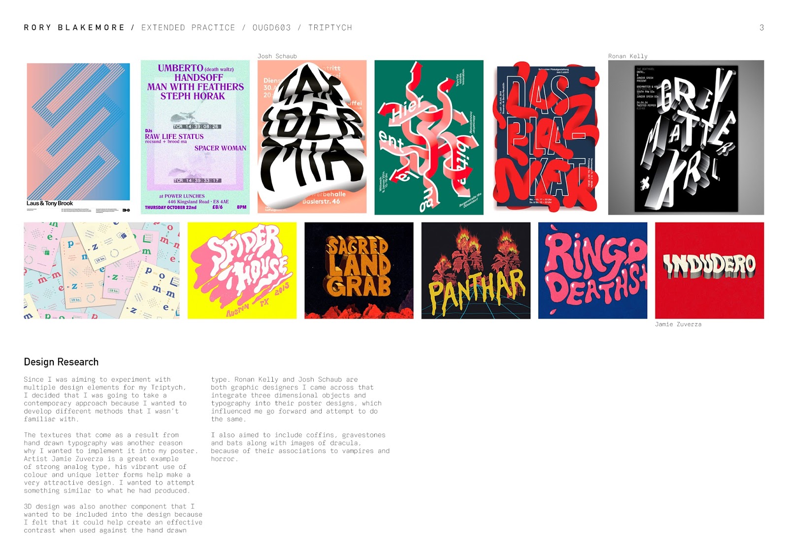
Since the Triptych brief is a poster design brief I researched online for poster designs that I found to be interesting and contain properties that I wanted to explore.


Ronan Kelly
Irish graphic designer Ronan Kelly has created these superb monochromatic posters for various electronic music events and club nights based in the UK. I'm overwhelmed at the textures featured throughout these designs and very jealous that I haven't done anything similar at the same time. All of these designs seem to be digitally produced, which leaves me wondering how they were done and what software was used. Although I'm certain most of these could be done within photoshop. The monochromatic theme throughout these designs is very effective and the colour red used on the DJ EZ poster works very well too because of the contrast.


Josh Schraub
Josh Schraub is a graphic designer from Switzerland who integrates a lot of three dimensional objects and typography into his work and poster designs, which has influenced me go forward and attempt to do the same.


Steve Harrington
I've been following his work for quite a few years now and have always loved his style. It hasn't changed all that much over the years. Illustrations with gradients, half tones, characters, shapes, vibrant colour palettes and with thick outlines are often featured throughout his work.


Jaime Zuverza
The textures that come as a result from hand drawn typography was another reason why I wanted to implement it into my poster. Artist Jamie Zuverza is a great example of strong analog type, his vibrant use of colour and unique letter forms help make a very attractive design. I wanted to attempt something similar to what he had produced. These following images all showcase some really unique, fresh, funky and eye grabbing type work. I'm in awe of how crazy his portfolio and website is. There is a whole archive on there, go check it out.
http://www.zuverza.com/


DEVELOPMENT
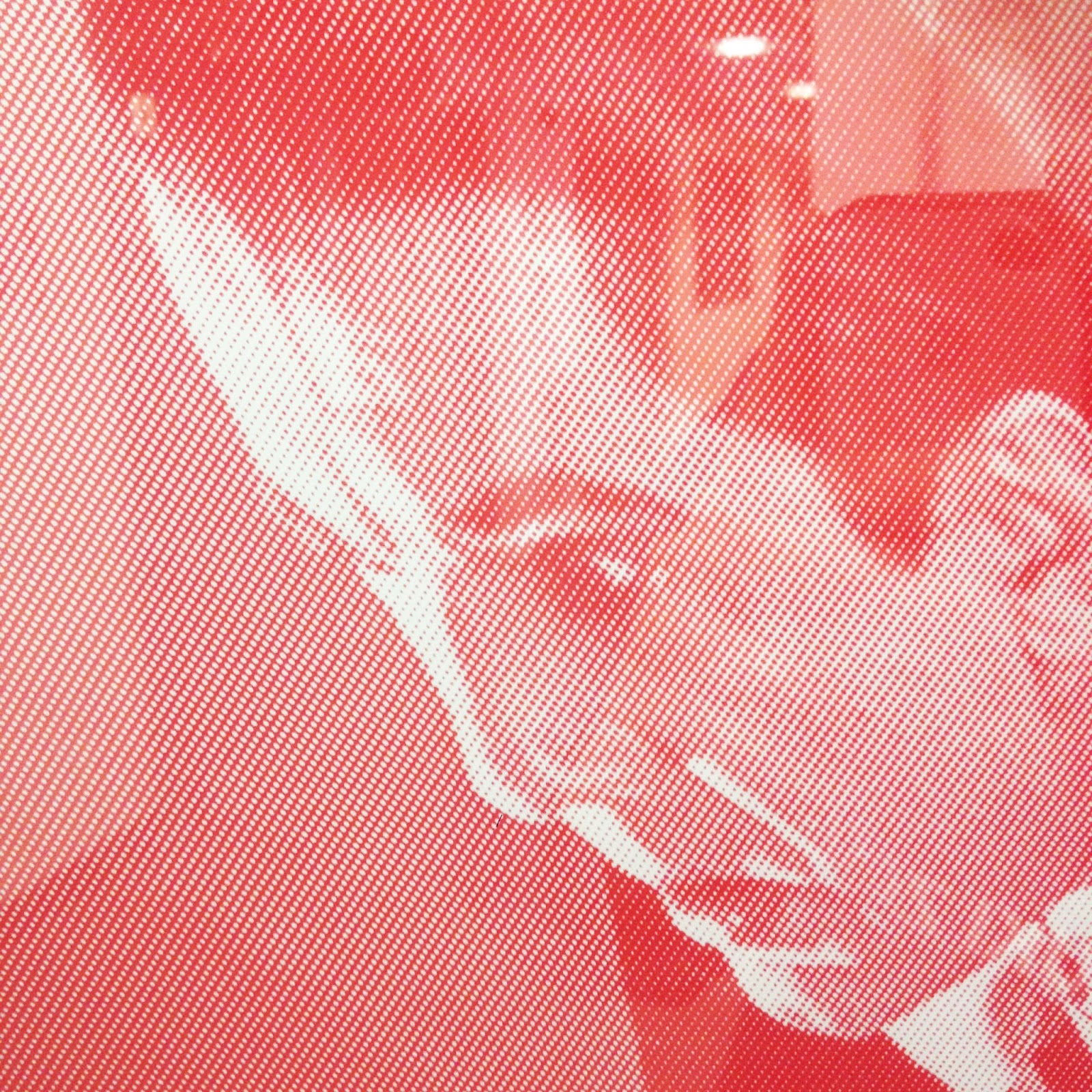
I started off the design process by creating a blue gradient for the poster background because I wanted to add depth to the design. Half tone dots were then applied to stills from the Dracula film because I loved the texture that they brought across. Duo tones were also used on the dracula images for them to become pink and purple because really like the duo tone effect when used on imagery and I wanted to create an eye catching design. The pink and purple colours I have used on the duo tone images also contrast really well with the blue gradient background.
I have also tried to create a moire effect with the dracula images by using the half tones and stretching the perspective. On my screen it showed a moire effect, however it didn’t show when printed out. I really wanted the moire effect to work because if it had then it would of added another interesting quality to the poster. I left the images of dracula stretched out because I liked how it altered the perspective. A perspective grid was also inverted and placed behind the dracula images, adding even more depth to the overall design.


Three dimensional coffins and gravestones were then implemented into the design since they’re synonymous with vampires and horror. These renders have not been made by myself, as I have purchased them from online. A silver colour and a multi-coloured purple, which haven't been used for anything else in the design, have been used for the coffins because I wanted them to stand out. The lighting and material effect of the colours used in Cinema 4D have created an attractive texture/finish to the coffins and gravestones. They have also been placed in front and behind the other images and elements on my design to demonstrate further depth.


For the hand drawn type element I have used the phrase ‘Back from the dead’ since it has been used on previous poster designs for the original Dracula films. I scanned the letters in, which have been influenced from Jaime Zuverza's work, and edited them in photoshop. I applied a duo tone to the type to bring out the detail and then put a blue overprint colour on top for it to match with the blue background. I placed the hand drawn type at the top of the page and in the centre because I wanted it to be the main focal point of the poster design, so people would see it and read it first and then explore the rest of the design with their eyes.


I decided to use the font calibre for the date and description on my design because its a neutral font and it doesn't interfere with the main design. Behind the Dracula images calibre is also used in an outline because if it was filled in black it would attract too much attention away from the details of the design.


My overall aim of utilising the Triptych brief to experiment with various elements and take a contemporary approach with the poster design has been achieved, especially since 3D items, hand rendered text, half tone and duo tone were incorporated into the final poster design. I valued this project because of the new methods I learned whilst working with different softwares and how I could transform my own hand drawn type into a digital realm and present it effectively. learning how to amalgamate different elements within a design has been very beneficial too as it's something I plan on developing within other projects. Digital print was used to print my design for because it involved a lot of editing and would be near impossible to complete as a screen print. The quality of the final print is great, however after changing the colour mode to CMYK the pink Dracula image lost quite a bit of vibrance and appeared less pink, although it still came out looking good. However, if I had more on the Triptych poster I would of loved to of incorporated more hand drawn type, I feel that there are some vacant spaces on my design that could of been filled up with some different components relating to the Dracula film. I also believe that each of our Triptych designs have been successful in informing the audience about an event that happened on the 15th of february. The three of us have produced a very strong set of posters for Triptych, which look great together.
Design boards


No comments:
Post a Comment