I used georgia because it represents a traditional aesthetic of which is relative to beer and it's heritage from a historic point of view. Avenir was used for subheadings and enlarged quotations to keep a balance of serif and sans serif. I prefer the use of serif body copy as It's more readable in my opinion.
I looked at magazines such as green soccer journal and printed pages. I emulated the image layouts that are used within them. I wanted to carry out this magazine format because I feel that it makes content easier to read and more attractive to the audience. I know beer is a huge commodity and has a well known culture, but beer isn't the most alluring subject to everyone, as not everyone is interested in beer. Magazines such as Green soccer journal make their content of which is football, attractive just because of their design. I don't even like football but I want to purchase their magazines because of the layout, it makes me want to read the information.
Facts
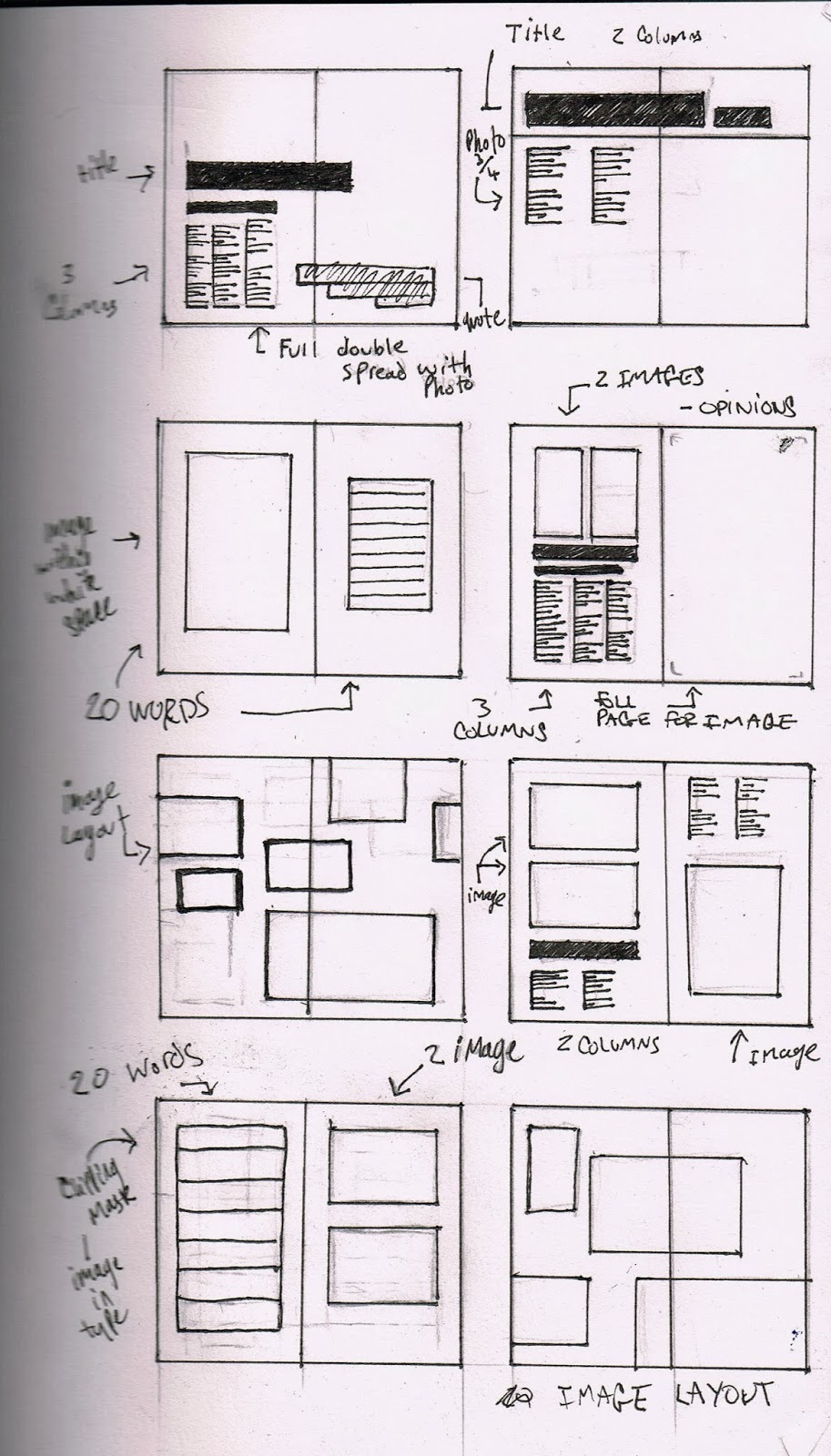
Used an Image to fit the full double spread to the bleed, I already had this idea previous to looking at layouts for reseach. I loved how this image had a grainy texture and I wanted it to be enlarged. I took inspiration from the printed pages with this also, as they too use full images on double page spreads.

20 Words
I wanted to keep this page simple and clean. I justified all the lines so it would mould the shape of a rectangle and flow with the portrait picture to the left. I like the layout of this page. It's simple and eye catching. I was stuck between the decision to make the text avenir or georgia, but I ended up choosing georgia because the serifs have a boldness that I'm fond of and I find makes it more fit into the traditional theme.

I replicated a similar format to what was used in the green soccer journal. A full image to the bleed on the right page and the same space taken up with images on the left. The images work well together in my opinion, but I'm unsure of the graph. I used the graph because It links in with the subject of branding.

No comments:
Post a Comment