COUNTRY LIVING MAGAZINE
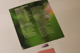
There are a total of 3 fonts in use on this magazine spread. The body copy uses a serif for the white background, which has similar characteristics to 'Baskerville Old Face'. Then there is a sans serif font used on the image to the left and the pink background, this font has similar characteristics to Avenir, Gill sans and Franklin Gothic. This sans serif is also used in capitals for the page heading, on the top left of the spread.
There is no commercial content on this page.
The large capital serif T catches the readers eye first because of it's contrast in size to the body text. The image below it within the white space is next to be seen. Then the sans serif body of text to the left on the depth of field in the photograph is put to focus on the reader. The article description with pink text on the white background is next in order at the top of the right page as it stands out from amongst the images. Then the sans serif text descriptions of the images in the pink square on the right page is the last type to be read.
Dissecting bodies of type from the page in order of which hits the eye of the reader and putting them into a hierarchy.
Initial type hierarchy of what meets the readers eye first.
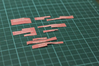
Cutting the different typographic elements from the bodies of text.
Cutting the bold and oblique text from the body copy.
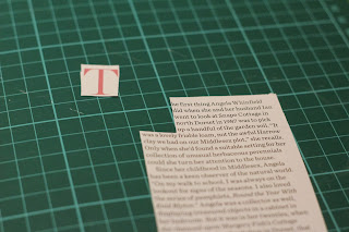
separating the large capital T from the body text.
Final Hierarchy of Type
This magazine spread had a lot of image content, which covered more space than actual text. I didn't find the layout to be that effective, but it does move the readers eye to the next piece of information in a hierarchy.
ART REVIEW MAGAZINE
There is a total of 5 fonts in use within this magazine spread. The title that reads 'Tino' is a bold sans serif font, which is similar to a bold gill sans. Above the bodies of text there are large quotes of text, displayed in a thin sans serif font. The name of the magazine which is position at the bottom right of the page, in line with the page number is presented in a sans serif font with a regular weight. Another font, which is a bold sans serif similar to franklin gothic, is used for the name of the person who wrote the article. For the body copy, the serif font Georgia is being used.
There is no commercial content on this magazine spread.
There are no Images either on this magazine spread, it is all editorial content.
The big bold title engages the reader first, and then does the largest quote from the article parrallel to the title on the right page. The Capital 'I' that introduces the body of text catches the eye next because of the contrast in size to the body copy. The bold sans serif name of the articles author is last type made to direct attention to.
I cut out the title, quote, author and body copy section. There is only 4 main section of type on this double page layout.
Initial hierarchy of type from what can be seen first to last.
Separating the magazine name and page numbers from the pages.
Dissecting the different weights and sizes of text in the thin sans serif quote.
Arranging the type in order of size/weight.
Final hierarchy of type.
SHORTLIST MAGAZINE
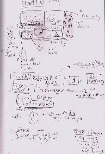
The huge image used is the obvious engagement for the audience, but the big bold text, "ALL GUNS BLAZING' is what is immediately read first. The hierarchy of type then leads us to read the beginning of the body copy as it starts with an enlarged capital 'B'. The bold blue sans serif text quote to the right is next in line to reach out to the audience. As the type has introduced the reader the the article at the bottom of the page the next section of type to direct the reader is the bold sub-heading at the top right of the page. This sub-heading then introduces the audience to the right column to read downwards.
There is no commercial content on this magazine spread. The images used respond to the content within the text as they are relavent to what has been written within the article.
The same typeface is used on this magazine spread. I noticed that there are the same sans serif characteristics throughout the type. The B especially, as throughout all weights there is an even join on the outside of the two bowls in the middle.
I cut out the title, enlarged capital B along with its body copy and then the bold sub-headings. These are placed at the top as they are what meets the reads eye first.
The smaller sizes of text in the body copy and picture descriptions are placed at the bottom of the hierarchy.
Initial type hierarchy of what can be read first to last in order of size/weight.
I then began dissecting all of the different typographic elements and decisions that were printed on the pages.
Separating the descriptions from the images and the Capital B from the body of text.
The order of type.
The page number is placed at the bottom because of it's small size and as it's usually not noticed by the audience.
Final Type Hierarchy


No comments:
Post a Comment