EYE MAGAZINE WEBSITE
This webpage showcases past issues of eye magazine and where you can order them, other than that there no commercials on this webpage. The images on the page relate to the information about the magazine. There are only 2 fonts being used on this webpage. Helvetica Bold is used for the title and sub-headings. Georgia is used for the serif body copy on the webpage.
The yellow background header at the top with black and pink text is what first grabs the attention of the viewer/reader. The orange circle below the yellow banner that is saying 'Buy Now', is next to be read as it stands out from the white background. The Sub-heading below in Bold Helvetica then directs the audience to read the small paragraph beneath. Then the image of Stefan Sagmeister reading eye magazine to the right of the layout catches the eye. Along to the left a smaller bold sub-heading in Helvetica, makes the reader follow along and read the paragraphs of text at the bottom of the page.
I cut out the header, title, orange link menu, subheadings and body copy and placed them in order of which strikes out first.
The initial hierarchy of type I cut out and placed.
Dissecting the different elements of typography from the printed webpage. Different weights, colour and sizes cut out.
Final Type Hierarchy
CLASH MUSIC MAGAZINE WEBSITE
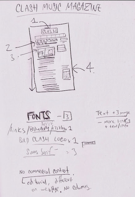
There is no commercial content on this webpage, other than links to other pages on the website. The images on this page are the front covers of their magazine, which the information talk about and link to where they can be purchased.
In total there is 3 fonts on this webpage. For the sub-heading and body copy, Georgia is being used. The Clash logo is a big heavy bold sans serif, which I'm assuming is custom to the magazine. There is also a thin, light sans serif font displayed on the webpage as links to other pages.
Firstly, The heading at the top of the Clash logo is first seen as it is big and bold. The bold georgia sub-heading is then next seen because it's the second largest section of type. The images below this are viewed, which are followed by the body of text which directs the reader to look into downwards. The separate subheading above the image of a magazine cover on the right is to then seen last as it does not follow on from any other type on the webpage.
The initial hierarchy of type from the webpage. In order of size/weight.
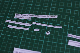
Dissecting different typographic elements such as; the hyper links and bold sections from the body of text
Dissecting the type from the magazine covers
Final Type Hierarchy
NORSE PROJECTS WEBSITE
This webpage uses the font Helvetica and Helvetica Neue, using different weights. Helvetica Neue Bold is used on the Title "Free Shipping" and Helvetica is used throughout on the body copy, sub headings and links. Besides the text in the middle showcasing free shipping, there are no commercials on this webpage and there is only one image behind the Bold text in the centre, which has inverted colours.
"Free Shipping" is what catches the eye first on this webpage because of the use of Bold sans serif typeface, which stands out from everything else as it is centred. When using websites with menus the top of the page is usually where they are, so after the focus on the bold text, the menu items are next within the hierarchy of information. On this page the menu goes along to right above a column . The audience will notice this column and follow it down to the body copy of links displayed.
Initial hierarchy of type. The website layout is very simple, there are only 4 main sections. The bold title, the menu header, the right menu and the column on text/links. In order of what is seen first to last.
Dissecting the different elements of type on the webpage.
The final type hierarchy


No comments:
Post a Comment