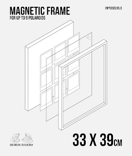
When I decided to use Impossible frames as the purpose for the backing papers I was unsure as whether or not to implement it within the brief as a selection of branding. However after some thought, it made sense to place the impossible logo within the layout of the design, otherwise my concept would lack consistency as I have replicated their format onto the backing paper design.
Comparing Bebas, Bebas Neue and Impossible.
I noticed that the counter in the 'P' is wider and shorter in the Impossible logo than Bebas. The bottom axis on the 'M' is more narrow too. It was interesting whilst I was moving the anchors of Bebas Neue to fit the Impossible Logo, a lot of the characteristics of the letterforms were very similar and it didn't take many changes with the anchors to get the right result. It's likely that Impossible altered Bebas and created their own hybrid typeface. I did try and find out what their typeface was, however there was no luck in finding anything.
Impossible use camera icons to inform the viewer what camera the product on their website works with. In this case, below the film is compatible with Polaroid Sx-70s and Impossible hardware.
I have incorporated Impossible's use of camera icons into my design to help the target audience distinguish what models of polaroid cameras the frames are for. I used the pen tool in illustrator and different line thicknesses to create some depth.
Layout
As I had gone with the decision to use the exploded diagram concept for the final designs, I still had to alter them as I had only previously mocked them up. The dimensions I've used are in centimetres and as Bebas doesn't have a lowercase letters the 'CM' was the same height as the numbers, which didn't look right. I asked my peers to see what they thought and they too said it needed to be smaller. I then reduced the size of the 'CM' and this made it more readable, as it was hard to understand the letters by the number before. (14 X 33CM < 14 X 33CM)
The title and dimensions were both made smaller in size as before they were quite large, I needed to make better use of the space. As I had other pieces of information that were minimised like the impossible logo, the 'MAGNETIC FRAME' and dimensions needed to be the first things that crossed the eye as well as the centred diagram. When I was satisfied with the layout, I implemented it on the other backing paper designs, allowing it to flow through all three designs and work as a set.
My Polaroids
These polaroids were taken in advance earlier this week, the last 3 were from a trip to antwerp earlier this year. I had planned from the start to use my own polaroid photographs, however I was uncertain on how I was going to incorporate them into the layout. I scanned them in and altered the colours within photoshop using curves. I really enjoy taking polaroids because you're never certain how they're going to turn out, as with using film cameras. It's much more interesting than digital. The process is rewarding once satisfied with the result. Light leaks and gradients of colour appear in polaroids after developing which give a nostalgic feel to them.
Photoshop
Photoshop has played an important role with the brief as we were told to manipulate our images and save/export the final files using photoshop. With my images I wanted to give the audience a better idea of how the polaroids would be inserted within the frame. I was able to accomplish this due to the skills learned from the photoshop workshops in the mac suite. As the sections within the diagram were at an angle, I needed to use 'skew' and 'distortion' on photoshop to make my polaroids fit in and appear realistic. The distortion tool allows the image to be stretched/skewed freely in any direction.
Placing the Illustrator file in photoshop
Selecting the image space with the magic wand and then using 'paste into', to allow the polaroid images to fit inside the outlines.
Using distortion to create a more realistic perspective with the images.


No comments:
Post a Comment