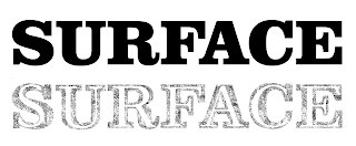
After I had finished altering the anatomical elements of the Garamond letters to fit inside Clarendon Black, I placed the alphabet inside a 4x7 grid and then aligned the rows and columns of letters.
I grouped the letters and centre aligned them to the artboard.
It was suggested to write a short paragraph about the typeface created for this brief. Here is what I wrote:

After completing the alphabet I wanted to put the letters into context, therefore I placed them into the word 'surface' as it was the word given to me to respond to. I also did the same to the word 'Garamond' because it's the typeface I have manipulated. I typed out the words in Clarendon Black and then spaced the letters out in the same distance, because Clarendon is shown on the outside of the typeface.
Final Alphabet
I created a negative version and printed it off too in the digital print resource at college. I did this because I wanted to see how it would turn out, because the initial letter 'G' I manipulated from was on black card as it was made from chalk. The negative version represented the chalk effect a lot better. However the short paragraph at the bottom is not as readable on the printed version because of the black background.
On the whole, I feel that I have successfully created an entire alphabet based off of one manipulated letterform. Although there are some letters I feel that are not as well manipulated as others, I still think that the typeface communicates the word 'surface' well, which was the word given to me to respond to in Studio Brief 1. I made sure that the letters were not too big and fitted on the page with a good amount white space. Even though I have produced a font within another font, the alphabet is still legible. The typeface can also be easily read, as I have already put it into words. Within the alphabet Garamond is appearing as another font on the 'surface'. The idea of placing Garamond inside another font in response to the word 'surface', is a strong concept in my opinion. Although the concept may not appear obvious to the viewer, but the chalk details within the typeface definitely represents the word 'surface', because of the textured effect.


No comments:
Post a Comment