I wanted to create type experiments for the majority of the pages that included quotes taken from internet comments, because I feel that exploring type can create very interesting outcomes and it's often highlighted throughout contemporary design. Whilst I visually responded to my chosen quotes for the zine, I further illustrated them by downloading images that were referenced within the comment. For example, one page of the zine contains a quote, which explains how a kid gets killed inside a shack, therefore I downloaded an image of a shack and placed it within the composition. I also made the typographic quote resemble a gravestone because it mentions death.
Other online comments that I have included have been hand drawn, rendered in 3D and even replicated to look like the original comment. I re-made these youtube/twitter comments because screenshots wont come out very well if they were to be risograph printed.
To be able to use more than one riso colour for my zine, I need to divide up my text, images and vectors onto different layers within my InDesign file so that the riso printer is able see the colours I want to used for each page. Since I had chosen to design for Ditto Press, it enabled me to use their coloured inks for my design. As mentioned before I really liked how pink and blue looked in contrast. Therefore I set up my file to use their Fluo Pink,Fed Blue and Black riso colours.
With this weird perverted quote I thought that turning it into 3d text would exaggerate it and make it appear quite humorous. I achieved this by using Cinema 4D, which was very simple. All i had to do was just use the type function and increase the depth.


I experimented with this comment using Cinema 4D as well. I had seen people create a waving flag effect using the software before and I wanted to try it out myself. Firstly, I created a simple arrangement of my chosen quote in photoshop. This jpeg was then saved and then allowed me to place it onto objects within Cinema 4D using the materials function. Materials in C4D are used to decorate the objects and shapes any colour you want. Any image can be wrapped around objects using the materials functions. The dimensions of my type design were the same of a flag, therefore I created a flag sized object in C4D which made it perfect for the JPEG to mould onto. For the waving flag effect to take place, I used the Cloth Nurbs option in C4D. This enables you to make any section of the object stationary, whilst the other sections are effected by forces of wind in different angles.
I stopped the animation preview at frames where the letters within text had folded over each other. Multiple versions were saved and I then picked one to include within the zine.


ok


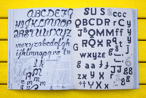
I produced my own type by hand using pencil, felt tip pens and my scanner. This allowed me to vectorise my drawings easily. Hand drawn typography has an unlimited amount of possibilities, so I was unsure of how I was going to approach the letter forms. I just wanted something simple that would add more character into my zine because the majority of the design layouts were very digital and modern. Involving hand drawn elements into the mix was key in keeping the content varied. I looked at Steven Heller's classic 'Typography Sketch Books' book to gain some inspiration.


This was the first quote that I responded to with hand drawn type. I wanted this to be pink because it fitted in the Dora The Explorer youtube name.


This comment mentioned HUF socks, so I drew a pair of them to be included within the composition.


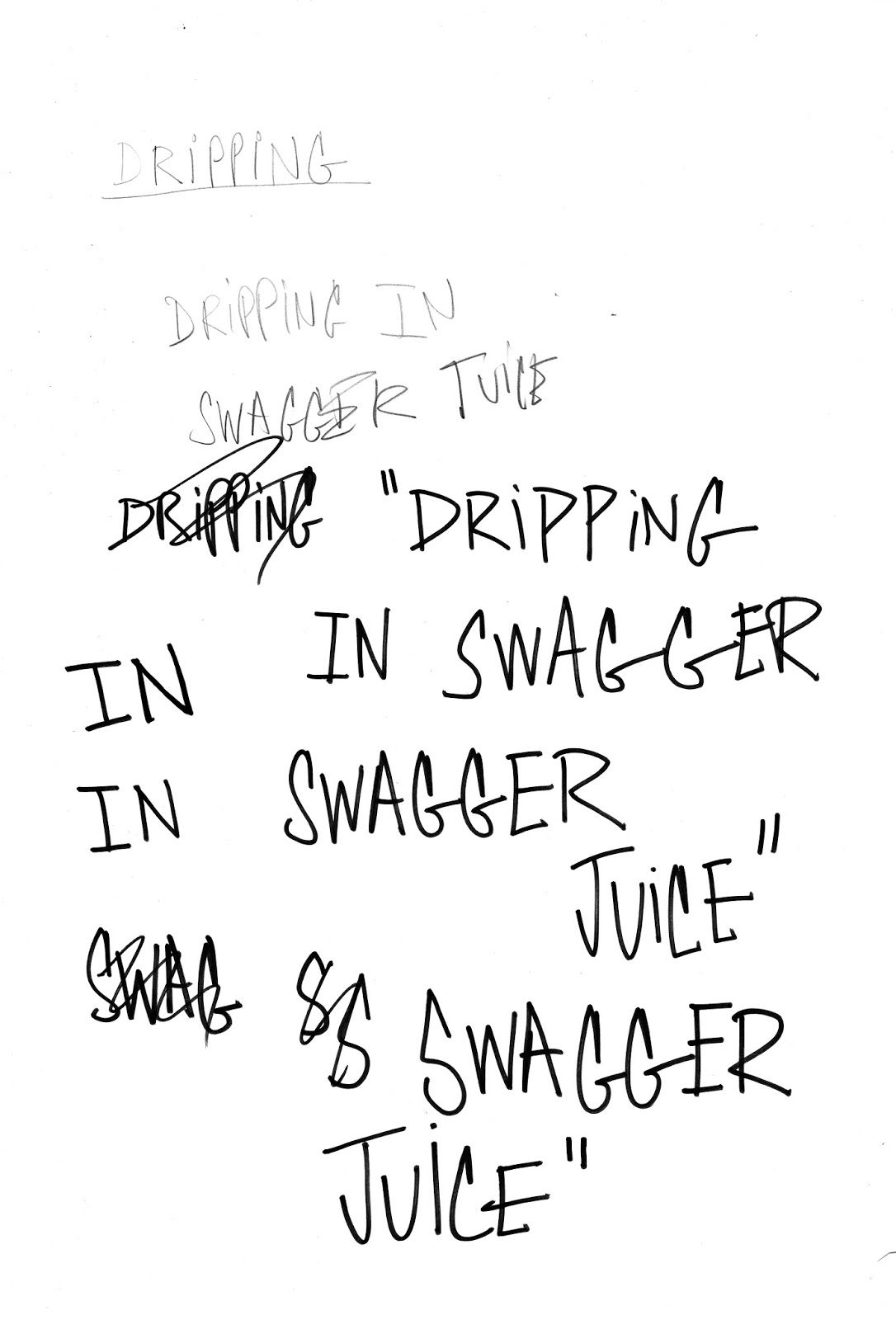
The second quote that I did hand drawn type with. As my first attempt stuck to the same bold uppercase 3D letters, I wanted to switch up all the words in this quote with different styles of hand drawn type. I'm really pleased with the end result on this, I think that it looks great. All of the words fit together nicely, even with the distinct differences in type style.


This is quote that I transformed into a grave stone using an Olde English font. I love this design so much and not only because it links into the original comment. I like it because I think that it would look super good on a t shirt, which makes sense since the design was influenced by t-shirt designs.


Univers Extra Black Extended was used on the front cover because I love how powerful the bold typeface looks. I initially wanted to illustrate the front cover and quickly placed type onto it when I started designing, however once I finished designing the content I thought it looked very strong, so I used the same type on the back cover but flipped it, to make it look like the back side of the type on the front cover. As I aimed to print using DRUK's riso colours, I implemented their 'FED BLUE' onto the front cover type and then placed a pink background behind because I had intended to do since I saw various other zines using pink inks and papers. I found that the blue Univers type on top of the pink really worked well, which meant that pink paper was going to be needed in order to achieve this when using risograph. Since I had planned to use pink stock on the front cover I wanted to use it for more of the pages in my zine. The double page spread in the middle of my publication had already been laid out and it featured a quote and image of Lil B THE BASED GOD, who is synonymous with the colour pink, which ultimately answered my question of 'What pages do I want to use pink on?'. One A4 piece of pink paper takes up 4 A5 pages so when placed in the middle, the page before and after will be pink.


Before any printing can be done, a proof file is needed, as well as a quote. For me to create the proof file I needed to change all the colours in my design from b & w to the monotone colours that I wanted my zine to be printed in, Proofs are used to give the printers a better idea of what the customers want their work to look like. I changed all my images to RGB files and then send the proof to ditto.
For me to be able to create a realistic design using the colours that were needed, I took the swatches from their website and then put them into all of my images/photographs, vectors and typefaces. This took a very LONG TIME. All the black and white monotone images I had initially placed needed to all be changed into colour monotones in photoshop. However I think if I used TIFF. files instead of JPEGS that it could of been faster as TIFF. files update themselves whilst being used in editing applications.


As I decided to use pink paper, I needed to find a company that produced it since DRUK hadn't stated that they had their own coloured papers. It does say that they can get any paper into their studio if the customer asks for it. Whilst writing out my quote to DRUK I needed to detail the papers that I wanted to use and I wasn't sure what to put down because I didn't know a company that produced pink paper. I rang them up and enquired about coloured stock and they suggested to use Coloraction paper as they produced pink stock. After googling it, I found the Coloraction Tropical Pink stock and got the swatch, which I used in InDesign to change the colours of the pages.


Unfortunately, when Ditto got back to me with my quote, it was far too expensive. It would of cost me £487 to produce 30 saddle stitched a5 zines. I couldn’t afford that; therefore I decided to use digital print for my zines as there wasn’t much time left before deadline.


No comments:
Post a Comment