
As Leeds Print Festival 2016 was approaching Level 6 graphic design had the oppurtunity to submit their designs for Leeds Print Festival and have them presented in an exhibition at Munro House.
G.F Smith Paper were supporting the event and had allowed for us to showcase their colour plan paper by printing our designs onto it. The aim of the project was to create a print based design that’s informed by a printing process.
I decided to complete this brief because print processes is an area of design that I needed to improve upon. 31 colours from G.F Smith’s colour plan paper range had been picked out and then each of them were assigned to 30 individuals our class. I was given the colour pistachio. At first I struggled with getting an idea for the design and didn’t know what colours I could print with because I was unfamiliar with the pistachio stock.
“The deadline is midday Thursday 31st March. Prints need to be flat and not rolled. Prints need to be 23 x 23 cm”
The only ideas I had at the beginning were all pistachio related due to the name of the stock and I didn’t think that developing them would work successfully.
However after getting feedback from members of the class and my tutor, they suggested to go with the literal route because it’s straight forward and connects to the given medium. This concept worked well for me because this brief had an approaching deadline and I wanted to take a simple approach so it could get completed on time.I looked into pistachio nuts and started gathering high quality images from creative commons, incase I wanted to incorporate them within my final design.


DESIGN RESEARCH
I plan on screen printing my design since it’s a process that often leaves interesting textures on prints, which is what I want to achieve. For my design I aim on using simple shapes and limited colours because I don't want to over complicate the design as this project is small and needs to be completed for the approaching deadline.
Another reason for keeping my design minimal is that it can usually make for a very effective print outcome. For example Jelle Marten’s eye catching work, often uses several colours and a single shape that’s printed into a pattern. The results end up looking very sharp, lively and geometric.
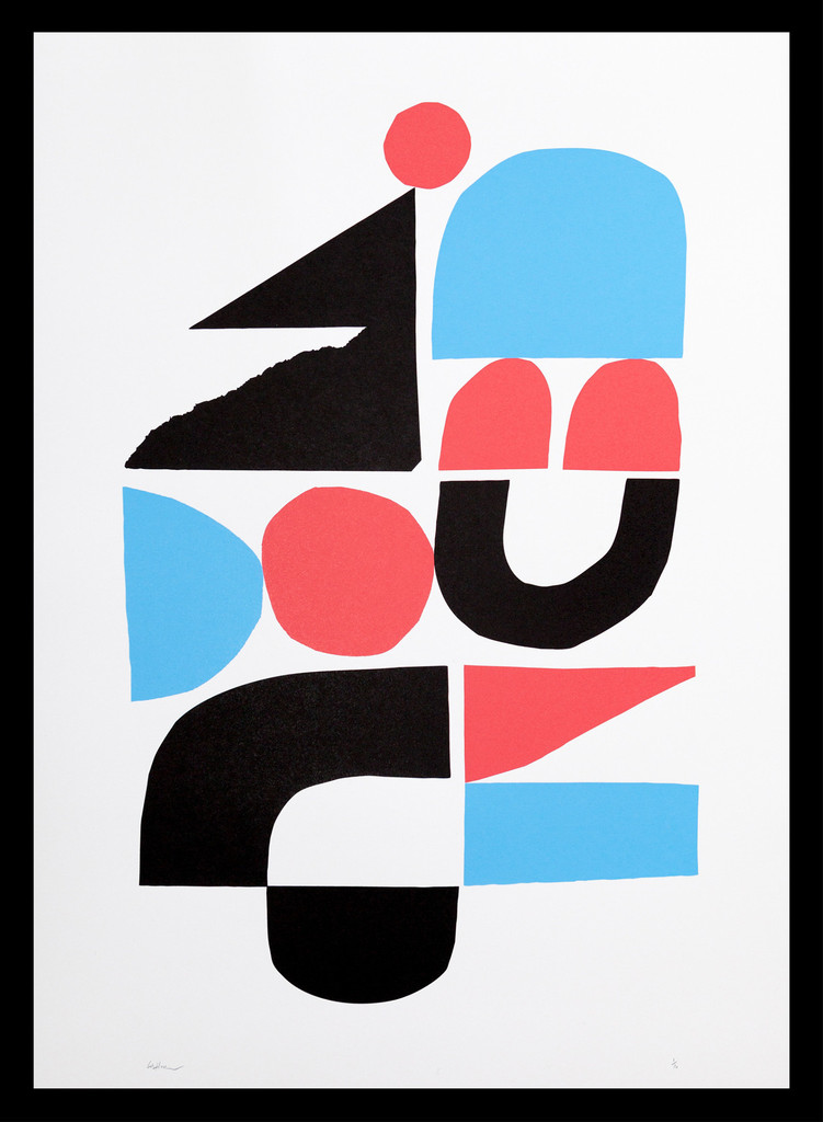
However illustration duo Atelier Bingo produce very successful prints using multiple colours and more intricate designs. I've decided to print with no more than 3 different colours though, mainly because I felt that if I did more it would over complicate the screen printing process and increase the chances of the design not printing correctly or not coming out right.


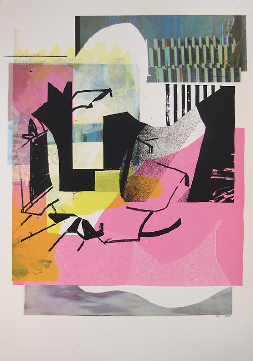

Jelle Martens
Jelle Martens is an illustrator, graphic designer and photographer from Belgium.
Here is a selection of some blissful screen printed geometric shapes. The prints look incredibly sharp and flawless, as if it was done my a machine. I love how you can still see the print marks within the colours of the shapes. If you look closely at the blue ink on the image below on the left you can see a slight texture.


Atelier Bingo
Atelier Bingo are two illustrators / surface pattern designers / graphic designers from France. Their work showcases a range of dynamic, abstract, vibrant art. Often creating patterns, blending different shapes together and overlaying bright colours within their artworks. I love what this creative duo are up to. Their screen prints are immaculate and are so visually attractive.


DEVELOPMENT
As I had decided on going with the literal approach in relation to the name of g.f smith paper, I first created pistachio shapes and experimented with them in illustrator. After this I took inspiration from my design research and started using simple block shapes and then placed the pistachios on top. I did this because I wanted there to be a contrast of two colours and shapes on the paper, making it stand out.
White was used for the pistachio shapes because it works well with the pistachio colour and lifts the design off the page. I wanted to incorporate half tones into the design because they can contribute great textures to prints. Therefore I included a half toned pistachio tree branch, which put more context behind the design too. Black was used because it looks crisp and is able to cover other colours whilst being screen printed.


Despite this the emulsion had been rubbed off the screen where the branch was exposed, this was due to ink used on the positives or the duration the design was exposed for. I contemplated exposing the screen again, but I went with it and taped off the areas where the emulsion had been removed when the screen was being cleaned.I also made sure that any holes or other design sections were taped off as well to reduce the chances of ink getting through the screen where it shouldn’t.
With my inks I made sure that the white was thick enough for it to come out opaque when screen printing, although because there was less binder the ink dried quicker.


Orange was used in my design initially for the block shapes however in the print room I used blue too because I wanted to experiment with colours. After printing out my first few designs I decided that blue looked better because it didn’t clash with the pistachio green, whereas the fluorescent orange did. I printed the designs with the pistachio branch and without it too just incase the branch came out really bad, luckily it still managed to print out.


FINAL OUTCOME
Altogether I feel that the 3 colour screen printed design I completed for Leeds Print Festival is very effective because of its use of simple shapes and colour. It also looks great in the exhibition.
When deciding on which print to choose for the exhibition I was unsure because I felt that the prints with the black pistachio branch were too messy. I asked people for feedback on what design they liked better and the majority preferred the version with the black branch even though it looked rough. This was because the branch presented screen printed qualities to the design and as the brief was about print processes people liked the effect.
However a couple people have said my pistachio design looks like pacman. If I made improvements to the design I would design the actual pistachio nut and place it inside the shell, this could make it look less like pacman. I’m pleased with the final result and feel that I have produced a successful piece of work, even with the screen printing mistakes that occurred because they have ultimately put more emphasis on the print process involved. I definitely benefitted from entering this brief and printing my design because it gave me the chance to re-adapt to screen printing onto paper and building up my confidence with the over all process. Three colours were printed on to my design, which is the most I have ever used whilst screen printing and I plan on doing multiple colour prints in the future because of the confidence I gained with this project.


Exhibition
I visited the exhibition at munro house and saw all of level 6's designs for G.F Smith. It was really great to see all of the papers put next to each other. All of the colours next to each other with work printed on top looked very good, nothing seemed to clash with other. I'm proud of level 6 as a whole and feel lucky to have been a part of this exhibition.
I visited the exhibition at munro house and saw all of level 6's designs for G.F Smith. It was really great to see all of the papers put next to each other. All of the colours next to each other with work printed on top looked very good, nothing seemed to clash with other. I'm proud of level 6 as a whole and feel lucky to have been a part of this exhibition.


Design Boards


No comments:
Post a Comment