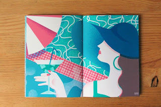
In order for me to do my own design work of hardware instruments I wanted to take a look at the designs that are already out there for similar things that I will aim at doing. From the results I have found, very few of them are actually aesthetically pleasing, a lot of them look nice to an extent but are pretty obvious in how the process has been done to create them. I want to try and avoid this from happening to my work. I don't want mine to be easily re-created. My Favourite work I came across is the content created for 'synth zine'. The style used for the synthesiser is amazing and it made me realise that I wouldn't have to go for the basic illustrator route, where I would have to start tracing the details of hardware. It gave me insight into other creative ways of visualising instruments. To me it appears that the illustrations on synth zine are more hands on and textured. The grid in the background along with the plants and vibrant colours, really bring it to life and give it an added layer that a lot of these other designs don't have. Most of them are bland illustrator jobs that every one has seen before. I don't to be like them, I'd rather do something more appealing and interesting.


No comments:
Post a Comment