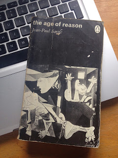
For the book cover, I decided to choose philosopher Jean-Paul Sartre, mainly because I already have several of his books. The ones I own, which are published by penguin, all feature works of art done by Pablo Picasso. I looked at other variants of his book covers to see what the most cliché things were, or to see the general look that has been represented so far.
When starting to think of ways to visualise the book cover, I wanted to bring something simple to the design. The book. 'the age of reason', explores the concept of freedom and the journey of life, as well as being an existential book in general. I liked the idea of representing an aesthetic in relation to the ideology. I thought incorporating graphics that tricked the eye into seeing different things would work well and it reminded me of a record label that released music alongside artwork that brought forward simple mind/eye trickery with each record. The first design I saw from Clek Clek Boom Records was the 'French Fries - Champagne/Hugz Release', which featured the symbol of the 3 rectangular blocks that could also be seen as 4. After looking into the artwork on these releases, I also looked at other visual illusions similar to the work on Animal Collectives 'Merriweather Post Pavilion' album cover. However I soon decided to go back to the drawing board and come at the design from another angle. I didn't feel that it would resemble a strong image for the book cover. I wanted to bring some texture to the cover, not just a simple vector graphic of a confusing symbol/icon.
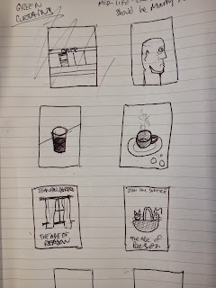
Here are my Drawing and thumbnails for my layout ideas. The ideas I had which resembled life decisions or freedom, which was the main factor in the book, happened to be the most obvious visual representations. For example when I think of life decisions, I visualise a fork in the road. Then when typing into google, life decisions, the same shit comes up. Really bad imagery of forks in roads and road signs with loads of arrows. Therefore I didn't want to partake in the heap of bad cliché ideas, and needed to do something different. One of my ideas was very simple and just included a profile of a persons face and it looked the best to me, even if it was my first idea. I asked my friends and they too said it looked best. So I drew it bigger and then took a picture of it, then put it onto photoshop. I decided not to scan it because I wanted a grainy texture to be brought along with the image.
Here are my variations of the illustration and over layed images put together.
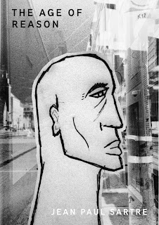
Final Design
I'm Satisfied with how my final designed turned out. After experimenting with a lot of different colours, I'm happy with the one I have chosen. I believe that it works well and brings out the type and imagery, creating a good contrast. The typeface used is Madras, which I purchased from 10 dollar fonts, and presents a strong, clear visual. In comparison to the other designs that Jean-Paul Sartre has had with his books, This design seperates from the general aesthetic and becomes its own. I used my own imagery, illustration and photography for this design.


No comments:
Post a Comment