15 Seconds of Pure Vice
The Brief
Create a 10 to 15 second
interpretation of the spirit of VICE’s Rule Britannia series in the form of a
motion graphics ident.
Considerations
- The series is ongoing.
- You can use video footage and or animation.
- Will you put a spin on traditional ‘Britannia’ imagery, or take another route altogether?
- The current ident is based around the flag and national anthem, but VICE want to see something different. Be brave and don’t feel you have to be literal.
- Audio isn’t essential, but is better to include this if you can. A sound design or original piece is preferable to an existing track.
Logic - Laying down chords and ambient sound.
The idea in terms of audio was to create a british sound, something taken from the british anthem. However I didn't follow through with the idea. I did search for the chords used on the british anthem or something similar online and found a page with chords. So I just used the three chords from the sheet I found, which were supposed to be on the british national anthem and put them into logic.
Curating clips from the rule britannia series and cutting them down.
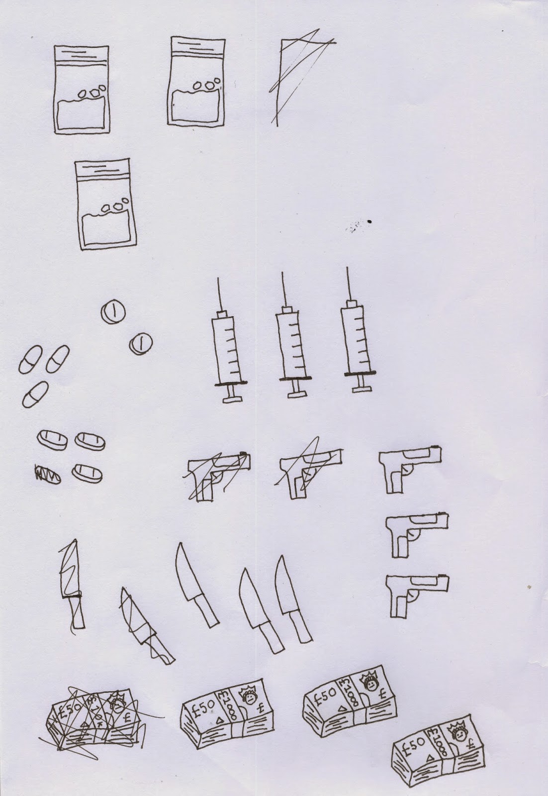
Animation Illustrations
After scanning the drawings in and editing the contrast/brightness, I separated each version on every illustration and saved them as pngs so i could put them over the top of the video.
Buraka Tattoo Flash
The style I wanted to take forward with the illustrations that I had in mind for the end of the ident, were similar to the illustrations / tattoo designs that are used at Buraka Tattoo Flash. Very simple, effective and down right rad.
Final Animation Composition

used an actual still from a video on their site with their layout of logo and text. I used this to help the placement of the logo/text at the start of my ident. I found out that vice use trade gothic as their main font, which is used on their videos and website.
Creating an audio piece was something I
wanted to do straight away. I planned to make the music first and then add in
the footage from the Rule Britannia series later. My aim for the music was for
it to be simple and neutral. I didn’t want to create an electronic beat or a
guitar riff because they wouldn’t fit. As the ident is for a series that
showcases the different sides of british culture, it couldn’t be a specific
type of sound, it needed
to be neutral and not distract the
audience. After much experimentation, I played around with three simple chords,
then found a pattern I liked and recorded it. I also added ambient noise in the
background to help fill out the audio piece.
The next step was looking through the
episodes from rule britannia and cutting out the clips which I found the most
effective. The aim was to create an emotive ident that brought some of the
characters and moments from the series forward to the audience. I managed to
curate a selection of video clips, which I felt were captivating. After some
trial and error within After Effects, I was satisfied with the order.
For the ending ‘Rule Britannia’ logo/text
I wanted to incorporate something that would represent Britian in a slightly
patriotic way and also a gritty aspect. I included a crown to resemble the UK
and also revealed the under belly of britain with the illustrations underneath
the text. I chose
the font Gill Sans because it’s a British
font, created by Eric Gill. It is
also associated with the font that’s used
on the ‘Keep Calm & Carry On’ posters. Gill Sans is also influenced by
Johnston typeface which is used on the London Underground. The use of Gill Sans
also fits the theme of ‘Rule Britannia’ even more as it too has its own dark
side. After Eric Gill died, it was later discovered that he had sexually abused
his children and performed sexual acts with his dog.
Submitted to d&ad
- design board -


.jpg)


No comments:
Post a Comment