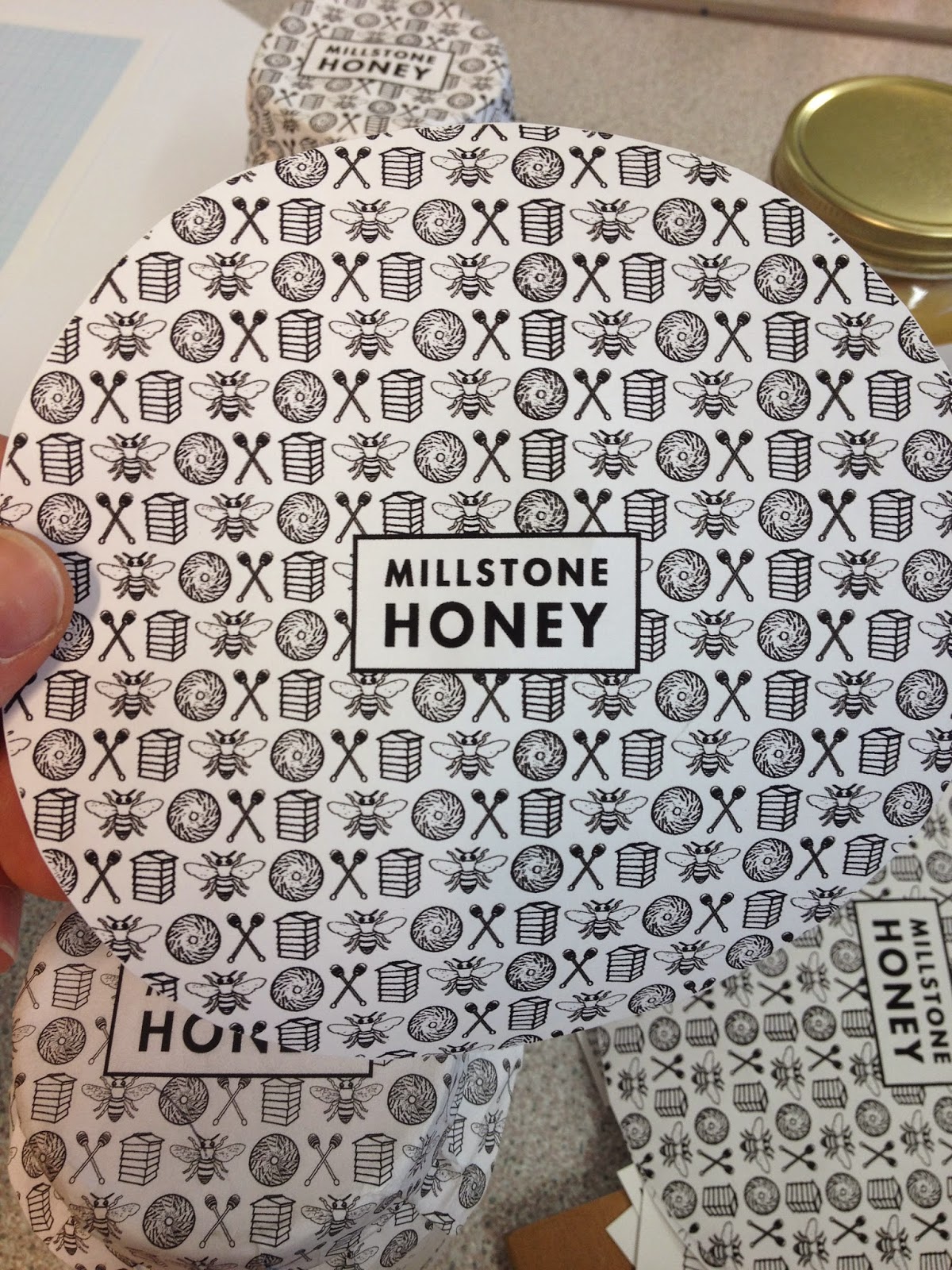
I had to reprint the wraps because the quality of the first prints were not good enough, I had to tell james to up the quality in digital print. White rubber bands are used to keep the wraps intact and black wax ribbon is put through the tags.
After I had printed and put together the jars, I wanted to take good photos of the finished items. Taking good photos was something I made importance of, mainly because I wanted them to go on my portfolio and for the honey to gain some potential recognition. I have my own soft lights and roll of paper so I did a photo shoot in my own room, because the photography studio at college was booked up. I'm happy with how the photos turned out, although white on white background is hard to get looking decent. Lighting is a major part of studio photography and I'm not experienced enough to know how to get it right straight away. Theres a lot of trial and error when it comes to lighting, it's actually really hard and annoying.
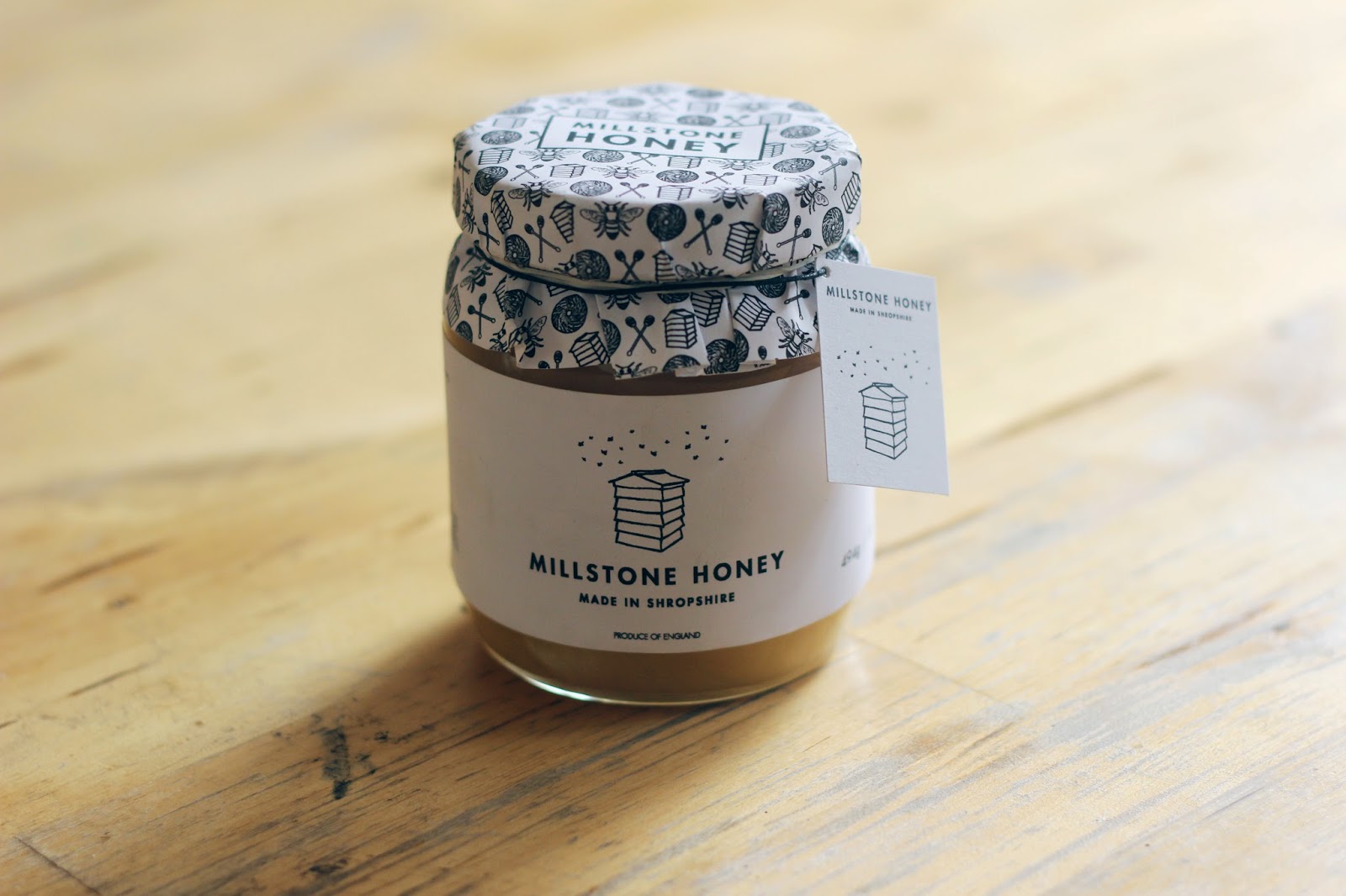
As well as the studio pictures I wanted to take photos of the honey jars in daylight. Being a product used in the home I wanted something that brought that into a photo. Not too much preparation went into the photos but I liked how they looked, with just a jar on a wooden table.
-
On the whole I'm pleased with how the final outcome turned out. It's a relief that the project is finished. Doing something for your family can get frustrating at times, especially when they don't quite understand the things you have to do to accomplish certain aspects. My dad is really happy with the outcome and is looking forward to them being used on his honey when he starts making it in the summer. This is my most extensive project for responsive as I have had a long creative process, which involved a lot of design decisions such as; naming the product, creating the identity and printing/making the physical product. I met the requirements and surpassed what was needed. Millstone Honey has definitely succeeded in its goal to become a local honey product with an attractive and fresh aesthetic. The visual element will bring more attention to it for sure and those who will be seeing it in local shops around the shropshire region will be more likely to purchase it compared to others, especially because most local honey designs are appalling. I'm happy with each aspect that's been designed and I feel that it's stronger than a lot of branded honey out there. It's been enjoyable designing something for my father, which in the near future will be sold at local shops as well as from the Millstone itself.


No comments:
Post a Comment