


I also tried using fine liner and sharpies for drawing my faces, but I still feel that biro gives more depth within the illustrations. The lines here are too crisp.


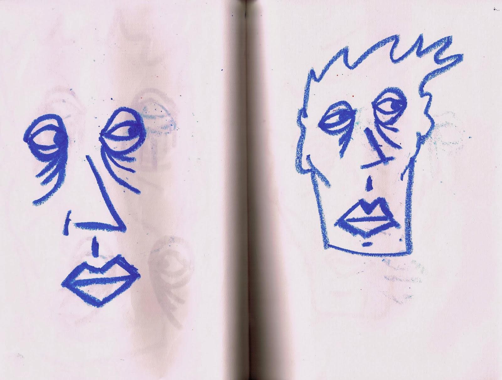
I decided to draw faces with pastels in my sketchbook, I like the textures that pastels create. I scanned my sketchbook pages in and then erased the white backgrounds in photoshop. Then I placed the pastel faces on top of the initial illustration I had created.


More adaptations / Variations
I had asked a classmate for his opinion on the use of my pastel faces on top of my illustrations and he suggested that I should use opacity on the pastel drawings so that the initial illustration in the background would show through the pastel. I then started using multiply and darken on layers within photoshop, allowing the pastel image to sink on top of the background illustrations, which made them appear more effective.


Trying out negative/inverted variations and testing different spacial compositions.


I feel that I'm close to finishing these designs, but there are more variations and experimentations I want to carry out with them. I'm going to have to make a few decisions on which will be the final few. I can't choose that many final ones with these illustrations because they are all very similar to each other. I think I will enter one with the inverted background and one with the original white background. Otherwise If I entered more the judges would get familiarised with them far too easy and it would probably decrease the chance of any of them getting in.
No comments:
Post a Comment