I have been experimenting with the RBG channels in Photoshop on the oil pastel illustrations. I also created more variants by inverting the colours of the oil pastel drawings and the background illustration. With these designs, the positioning was probably the thing that took the longest. They are tilted and don't appear to look right if they are centre aligned with the photoshop tool. Therefore it took a while to get the balance of positioning the face near enough in the middle whilst on a tilt to look centred.


Repetition & Symmetry within Imagery
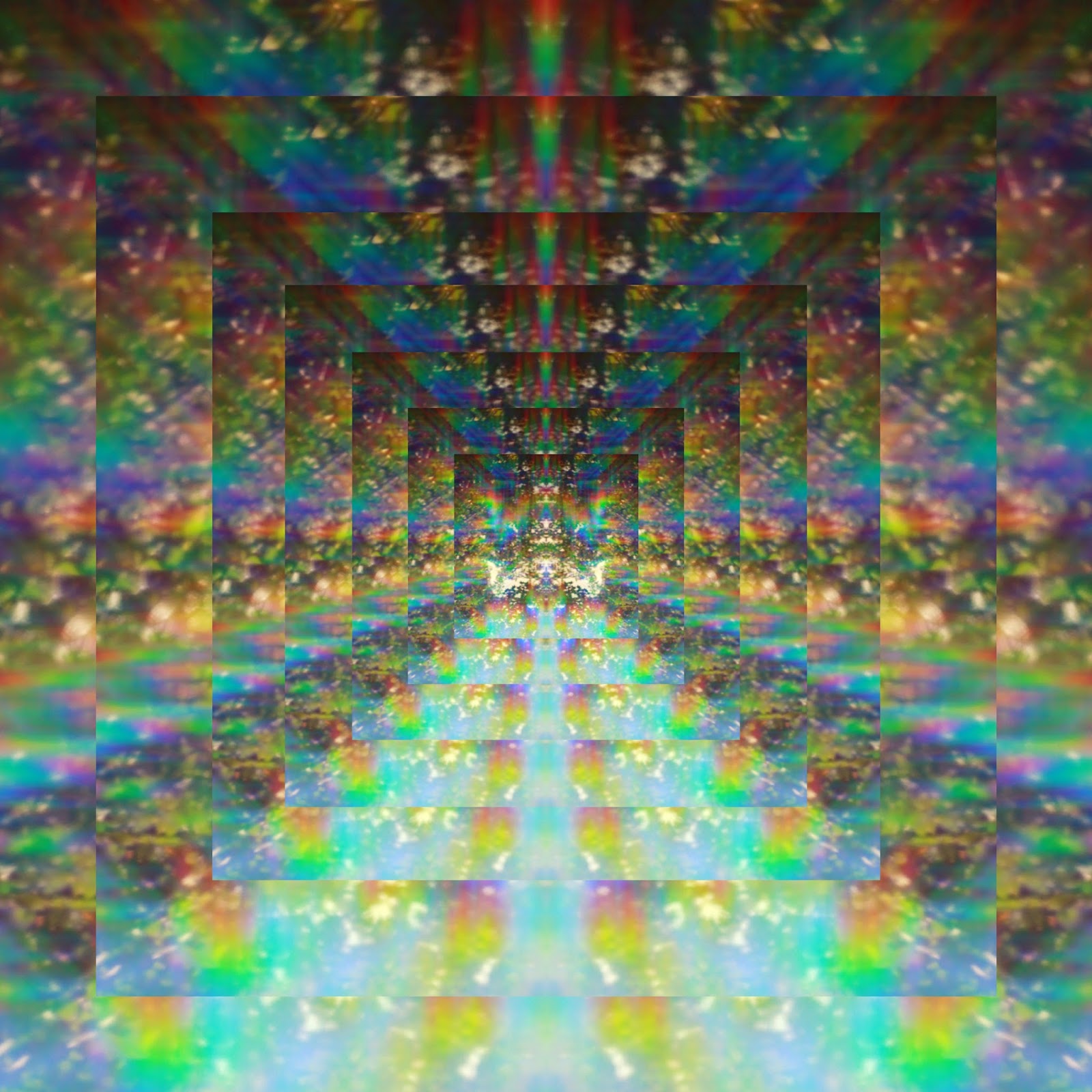
I went back to the designs I had created inspired by Leif Podhajsky because I felt that they could be improved. I played with the use of repetition within circular imagery. The more psychedelic green repeated image design has become more effective than it was before. I rotated the images around within both variations and it changed how effective it was drastically. It made it much appealing on the whole.


This project has limited the use of type on the record sleeve designs as it could give away the musical artist that your designing for. I wanted to play with a couple typefaces on these symmetrical designs and see what the record cover would look like with the song name places within the composition. I am not using any type on any of my designs for submission.


Decisions to make
Below are the selected designed I have to whittle down before submitting to Secret 7.
I want to include at least one with a white background and another with the inverted background.


No comments:
Post a Comment