Today in our design principles lesson we were told to share the information we had collected over the past week, for the 10 things you should know about graphic design, to our groups.
We have now been informed that the second studio brief, now takes an individual approach with the information that was collected by the group. We can now take these pieces of information and resources and place them into our own double page spreads. Fred told us to choose out of the 10 initial question; 5 of them that were definite and 5 that are possibilities.
5 Definite Questions/Statements
What are the key aspects in the anatomy of type?
What are the different font classifications?
What are the key aspects that effect readability + legibility?
How can type and layout be used to effect read order?
What is additive / subtractive colour?
I have yet to compile the research, but here are my current 5 questions I have chosen to look into.
5 Individual Questions/Statements (possible)
Most influential type faces http://100besttypefaces.com/
How is woodblock type made?
What are the advantages/disadvantages of Digital + Traditional Printing methods?
Influential Graphic Designers
Design Movements in graphic design.
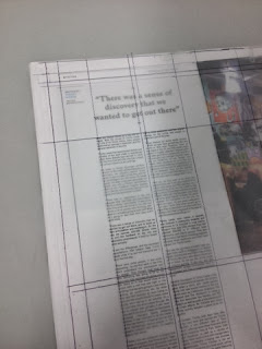
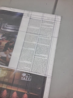
In the lesson with Fred, we were told to bring in 3 different newspapers / magazines. The task involved sticking tracing paper over selected pages from double page spread layouts and mapping out the grid systems used by drawing the lines around images and text boxes. This task helped us get better ideas on how different publications use different grid formats and systems. It has helped changed the way I assess and analyse a page layouts from looking at them.
The Independent
The grid system used for The Independent consists of a 12 column grid layout across the double page spreads. The grid layout appears to be quite complex, but in my opinion The Independent is a well crafted newspaper that allows the information to be digested quite easily.
Private Eye
Private Eye uses a 6 column grid layout throughout.
I also noticed on the double page I traced over that both pages started with an advert that indented on top of the left column. However this isn't consistent throughout the other double page spread within Private Eye.
The City Talking


The City Talking's reveals it's grid somewhat with the lines that overlap over one another around the near the perimeter of the pages. However, each page contains a 2 column text arrangement placed within a layout that includes images. The page I initially traced had a 2 columns of text arranged to the right side of the right page, of which was used again on another double page spread within the newspaper. My only complaints with this newspaper is that its quite 'trendy' with its aesthetic and grid layout, which makes sense as it is aimed at a younger audience, however in my opinion the layout isn't consistent enough. Although the use of varied placement of text and images is consistent throughout.
The Fly
Throughout the publication it used a 4 column layout on singular pages and to 8 column grid layout for double page spreads.
8 column grid system below used on another spread.
This is some of the vital information on grids that is needed to be read and understood in order to get a better perspective from Fred's lesson.
Single-Column Grid
Every time you open a new document in a page layout program, you are prompted to create a grid. The simplest grid consists of a single column of text surrounded by margins. By asking for page dimensions and margin widths from the outset, layout programs encourage you to design your page from the outside in. (The text column is the space left over when the margins have been subtracted.) Alternatively, you can design your page from the inside out, by setting your margins to zero and then positioning guidelines and text boxes on a blank page. This allows you to experiment with the margins and columns rather than making a commitment as soon as you open a new document. You can add guidelines to a master page after they meet your satisfaction.
Multicolumn Grid
While single-column grids work well for simple documents, multicolumn grids provide flexible formats for publications that have a complex hierarchy or that integrate text and illustrations. The more columns you create, the more flexible your grid becomes. You can use the grid to articulate the hierarchy of the publication by creating zones for different kinds of content. A text or image can occupy a single column or it can span several. Not all the space has to be filled.
Modular Grid
A modular grid has consistent horizontal divisions from top to bottom in addition to vertical divisions from left to right. These modules govern the placement and cropping of pictures as well as text. In the 1950s and 1960s, Swiss graphic designers including Gerstner, Ruder, and Müller-Brockmann devised modular grid systems like the one shown here.
Karl Gerstner's Modular Grid
Golden Section
No book about typography would be complete without a discussion of the golden section, a ratio (relationship between two numbers) that has been used in Western art and architecture for more than two thousand years. The formula for the golden section is a : b = b : (a÷b). This means that the smaller of the two elements (such as the shorter side of a rectangle) relates to the larger element in the same way that the larger element related to the two parts combined. In other words, side a is to side b as side b is to the sum of both sides. Expressed numerically, the ratio for the golden sections is 1 : 1.618.
Some graphic designers are fascinated with the golden section and use it to create various grids and page formats-indeed, entire books have been written on the subject. Other designers believe that the golden section is no more valid as a basis for deriving sizes and proportions than other methods, such as beginning from standard industrial paper sizes, or dividing surfaces into halves or squares, or simply picking whole-number page formats and making logical divisions within them.
.jpg)
.jpg)
.jpg)


No comments:
Post a Comment