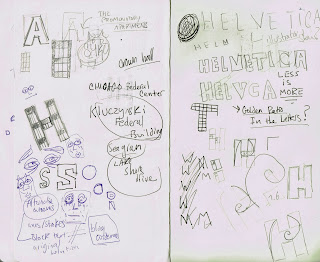
visual synecdoche experimentation.
I then decided that my final typeface was to be related to the Architect, Ludwig Mies van der Rohe. It was suggested in the comments from my crit to explore him further. Therefore, I went more in-depth with research into the him, which has lead me to manipulate helvetica in correspondence to his architecture.
Chicago Federal Building IBM Building
Promontory Apartments, Chicago
Kluczynski Federal Building
I looked at the structures different buildings that Ludwig had designed and I sketched different ways of how i could interpret the layout used and place it inside the letters of Helvetica.
After examining the windows on his buildings, I noticed that a lot of them shared similar grid system. After working out how I was going to execute the layout, I went into to illustrator and emulated the architectural layout of Ludwig's windows.
I changed the formations of the letters within Helvetica Bold. With rounded letters like the 'C', 'O' and 'Q', I added straight corners to resemble building structure. As I had done this to the rounded letters within the typeface, I balanced this out and added curves to letters, such as 'K' and 'E'. A few of the letters did not need altering as they already had a balanced look, with curves and straight sections. I had already experimented and edited the letters that have not been altered and added them with more straightened our corners and edges. But I received feedback from classmates saying it was unnecessary, so I left them.
After manipulating the Helvetica letter forms, I placed the Ludwig Grid into them using clipping masks on illustrator.
I then produced the name cards for my partner. The inverted versions work well because of the grid inside the letters, you can see it easier than when its used with a white background. I also think the typeface works well when it's placed into words. It's clearly legible as well as being readable when put into words.


-01.png)
No comments:
Post a Comment