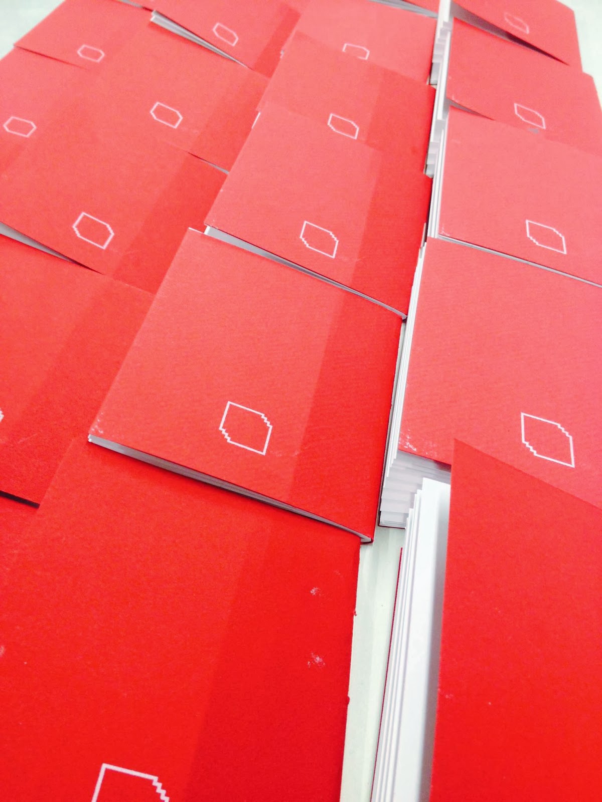
SCREEN PRINTING THE BOOKLETS
Aligning the booklets
We gave the booklets rounded corners by using the desktop corner cutter in the book binding section of vernon streets screen printing room.
Because we were using white ink, which is hard to screen print onto other colours, we had to mix it so it was 60/40 mix. Making the white show out more as more if was mixed in. Usually it would be the other way around.
Problems.
You always come across problems when screen printing at this stage. As students making mistakes and errors is a key learning element. We always improve and learn after these mistakes. Screen printing is a new process that we need to get to grips with and this is another reason why we all decided on screen printing these booklets. We wanted to make the effort into doing this and becoming more familiar with the layout and technique of screen printing.
This time round when Will began printing with the white ink, after about 20 or so booklets had been printed with the logo on the front cover the screens emulsion starting pulling off around the exposure of the logo. We think this was because too much ink was being used the screen hadn't been flooded properly and then will pulled down again creating another print of the logo that overlapped the one exposed. Too much ink meant that it got stuck to the emulsion of the screen and it then got pulled off.
Screen printing error
Because of the mistake on the screen, we couldn't finish off all the books we had binded which was annoying as we planned to give one out to each class member. However that was a bit of an optimistic idea, of which we could of achieved. We only managed to do around half of the booklets with a decent logo screen printed on the front cover.
Soon after our session we discussed with Neil at vernon street other ways how we should of done the booklet process. We realised that it would of been best to first screen print onto the sheets of red card and then cut them out. Placing the pages in and then finally binding them and cutting the corners off. This would of been a much easier process as it would make screen printing a lot simpler and accurate, as we had to be careful when aligning the booklets on the press because of their weight from the pages inside. But we have learned a lot from our mistakes so far.
Final Posters.
Will & Joe started on the posted earlier this week and I talked to them about the direction it should go in. Whilst brain storming ideas I came up with the 'how is your creative footprint idea. This was because of the research into carbon footprints in relevance to public transport. We wanted to implement one poster with an interesting or alarming fact too. The fact that stood out to us was.
"Switching one car journey in 25, or using the bus once a month can remove one billion car journeys from our roads, resulting in a reduction of 2m tonnes of CO2."
We represented this fact by creating 25 circles in a square and then filling one of them in black, to resemble the one care journey in 24. Will had put his clean, formal design skills to work on these posters and gave them a great modern and crisp aesthetic. We wanted to create these posters to raise awareness around the college for the different art and design principles to be aware and then get involved within the campaign. But we also wanted one with a factoid to send a message to the general public about how public transport is beneficial and let them know about Creative Commute.


-01.jpg)


No comments:
Post a Comment