Showing posts with label Augmented Design. Show all posts

Thursday, 8 January 2015

Augmented Design - Finals & Evaluation

I printed my poster off on a satin gloss finish as well as an off white stock too. I think I prefer the off white better because it's not as dark. I also used a gloss finish on the magazine advert because commonly magazines have a shiny finish on their pages and I wanted to recreate that.
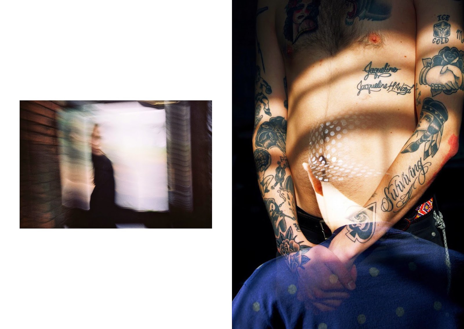
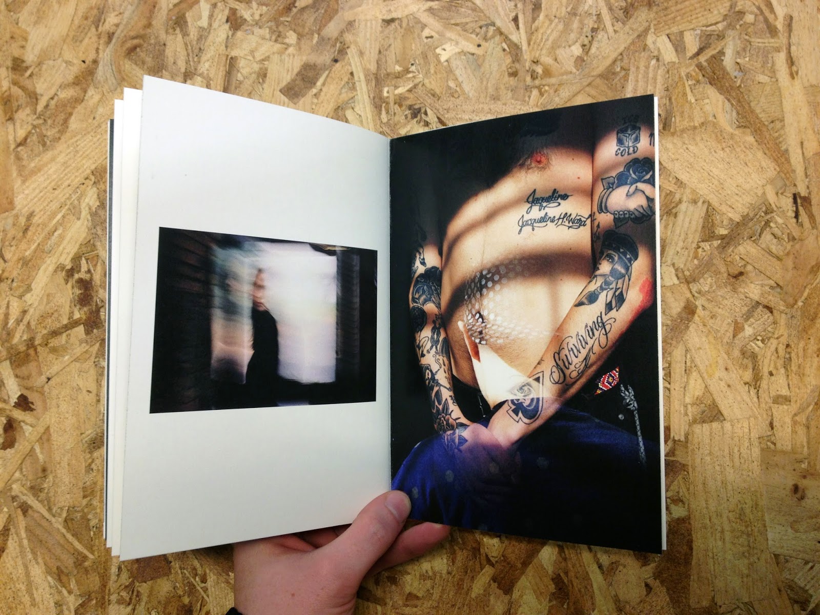
Final Booklet

Final Poster

Final Magazine Advert

Evaluation

Augmented design informed myself on a lot of new and interesting technology that is accessible in graphic design. My knowledge on graphic design has been improved, including areas such as commercial print, which the workshops informed us on. Keeping up to date with latest technology can improve the methods you incorporate in work so much. More innovative design work can be produced from learning modern methods, which can create a bigger impact and attract a larger audience. The brief made me realise how important it is to keep track of on going work out there that I can begin to learn about, which can improve my skill set as a designer. I was disappointed in the experimentation I carried out within the project, especially for the interactive segment. I feel I could of done more but the deadline soon approached and I had to meet the requirements. However I still feel that my designs meet their purposes and work well in line with the website ethos. I also think that I should of involved more of the knowledge gained from the digital print workshops we had, they were definitely beneficial with learning how different adobe software works with print, but I don’t think I really included anything from the workshops into my process. I already knew to use CMYK mode on my files to get ready for print. Although the techniques and lessons learned from the sessions will be used in future instances when it comes to digital print. There is a lot of potential for creating interesting work with augmented design and I ended up just using QR codes, which I wasn’t really satisfied fully with. I’m not keen on QR codes but It was still new territory to me and they did fit in with simple style that I had used for new exposure.  Also this brief raised more awareness to the decisions made when producing content; thinking about the production costs and how different materials would work over the long run. When creating design for real companies you would definitely have to consider the design variables with print and the maintenance that comes with augmented design, having to update things and make tweaks. On the whole I think each final piece of print has met the requirements I set out to reach and the project rationale still correctly sets out what I wanted to achieve with my print campaign. I’m pleased with how each piece came out and think that visually they all fit in with one another. They all communicate to the correct target audience and deliver the message across, while still representing the new exposure ethos. Looking back onto the final designs and the overall brand for new exposure I can see it working as a real idea, It’s definitely better that a lot of other things being done at the moment in my opinion.

Tuesday, 6 January 2015

Augmented Deisgn - Development & Design Decisions

Augmented Ideas
I drew a couple of ideas up for what could be used theoretically for the augmented piece of print. After looking at the thermo-sensitive black varnish being used for business cards I thought that it would look good on a magazine advert inside a polaroid on a page. The user would do as instructed and reveal the advert inside the polaroid. Another Idea I had was using 35mm film inside an advert, which the reader would have to wind on or pull to read all of the adverts information. Around the 35mm film would be a 35mm camera back, to make the reader feel as if they were loading a camera etc. However seeing as time was running out, these ideas were more just conceptual thoughts that I thought could be interesting if real. 

Poster Development
I wanted to create a simple exhibition poster and after looking at other examples which used a b&w image with white text, I wanted to do the same. I felt that I could create something that would stand out as I have a good collection of b&w photography I have taken. This image is actually at the Tate Modern in London, so it's a little odd that Im advertising an exhibition elsewhere, but the image looks strong in my opinion. Yeah basically experimentation with the poster was kept to a minimal as I was happy with how it already looked. I did adjust the angle of the photo so the vertical lines from the big window would stay straight, allowing the type to sit on top and below it. I mainly focused on the arrangement and hierarchy of type. It should work from reading new exposure first,  photography exhibition after, then onto the date/place and lastly the website link at the top. I also moved the 'photography exhibition' section lower as a classmate recommended that I did as it was too far up in the light. 

New Exposure Information/Photo Booklet
I wanted the A5 booklet to be in a photography booklet format as well as an informal piece which advertised the details of the competition and website. As I designed a photography site a photo booklet as a piece of printed content in my opinion links together well. It's also something people would want to pick up and look at. Photography zines are usually short, simple and use interesting photograph, which makes them quite attractive. I feel that the simple layout and placement of images in my booklet creates an appealing look which goes along with my initial ethos for new exposure. 
Front & Back
The image from the front cover comes over into the inside
This double page was designed as a small advert. What took the longest on this was what words to use. I wanted something appropriate and something that sounded attractive. I felt that 'View photography the way you want' fitted well in that the user is allowed to choose different options to see the pictures they want to see. 
This section explains what new exposure is about and focus's on the blog page of the website. This page gives the reader a chance to interact and scan an QR code, which shows the user the most recent photographic images on the website. I didn't want to incorporate the use of QR codes on my print campaign however I felt that it was an easy and accessible method of interactivity that most people are familiar with. The black and white code also fits within the new exposure aesthetic and house style. 
full bleed image
This QR code links mobiles to the submission page
 
As I mentioned about I decided to use QR codes for the interactive element of the print campaign. As well as the interactive competition that is done by submitting work on the websites submit page. I used QR code generator and tampered with the options. I never knew you could place images inside QR codes so I gave it ago with my logo and decided it didn't look good at all. I also used the blue colour that is used for the website links too. However I decided just to keep it black because it was the simplest. 

Making the booklet
After using digital print to print off the booklets I chopped the pages to a4. I printed the booklet on matt paper and off white stock. Then I used a bone folder to fold each of the pages separately. I used clips to hold the pages together and then stapled them in the college library. Then I cut the sides of the booklets so the pages were all flush. Out of the 2 booklets I prefer the off white a lot more, not only because it turned out to be put together better but because it feels nicer. I like how the off white looks with the images too. 
Here is the QR code in use. Once scanning it it comes up with the link and once opened you are able to slide view the recent image content that has been updated on the website.

Magazine Advert
As with everything else I have designed, I wanted this advert to be simple too. I started with placing a photograph and adding the words I placed on the first double spread in my booklet, which is also an advert almost. I liked the words I had wrote and felt they described what the website does well. Placing the logo took a while to decide, but I eventually inverted it and put it on the image and thought it was more attention grabbing. It also fits the logo on the exhibition poster, the majority of it's use is in black so I also thought that it would be more refreshing too if in white. Throughout the design process of the magazine advert I was trying to place the pieces of text in the right places. I had also inserted an iPhone with the 2 QR codes I used in the booklet, making this advert interactive too and convenient for people who want to enter the competition. Text was placed by each code describing their function and the rest was on the right. Also I used the same headline as the one in the booklet layout because I think it draws the audience in more and it sounds quite alluring. I felt that the design needed another image so I placed another from the same photographer. And then I adjusted the text on the right into two different parts with over hands on either side of the sentences because it made use of space better.