VISUAL RESEARCH
Seeing as 100% of the content for my collection zine was to be sourced from the internet, I wanted to include a lot of contemporary graphic design within the layout of the publication. This decision was also made because I felt that using contemporary design for an internet based project would help illustrate the content more effectively, since they’re both associated with one another. I gathered the majority of my design inspiration from rave zines that were sold in the 1990s and old magazines such as; Slash Mag and No Mag. These two magazines both featured a lot of really bold hardcore-esque type designs that jump out. They also indulge in weird type arrangements and layout design, which was what I wanted to include into my own zine.
Non-Porous studio from chicago have also created similar projects, where they have based the content from youtube comments. Their work is focused on more specific topics, as they produce zines based on youtube comments from Hardcore rave videos and comment found in WRX forums.
I also researched into Tony Arefin, who was a graphic designer. His use of imagery and simple type was like no other. The compositions he made were very powerful and very modern/contemproary at the time they were made. He is also one my all time favourite graphic designers, ever since I visited an exhibition on his work at the IKON gallery in Birmingham.
RAVE ZINES
I was able to get my hands on these images through a website that I had been linked to. There were so many rare zines integrated into this website, which can be found here; http://ravearchive.com/zine
As there is a tremendous amount of different zines, I flicked through the previews on the website and download the ones that I found to be most appealing. Sushi, Blaze, Interdance and Beyond were the Zines that I liked the best, mainly because of the experimental type layouts, bold fonts and solid contrasting images that were featured throughout them.


NON-POROUS STUDIO
Taking youtube comments found on Hardcore electronic music videos and re-interpreting it into a publication. Similar concept to my own, however this has a stronger focus. The rest of the zines below from Non-Porous are very like this hardcore zine, as they all focus on different topics by sourcing the content from specific websites or forums.


SLASH MAGAZINE
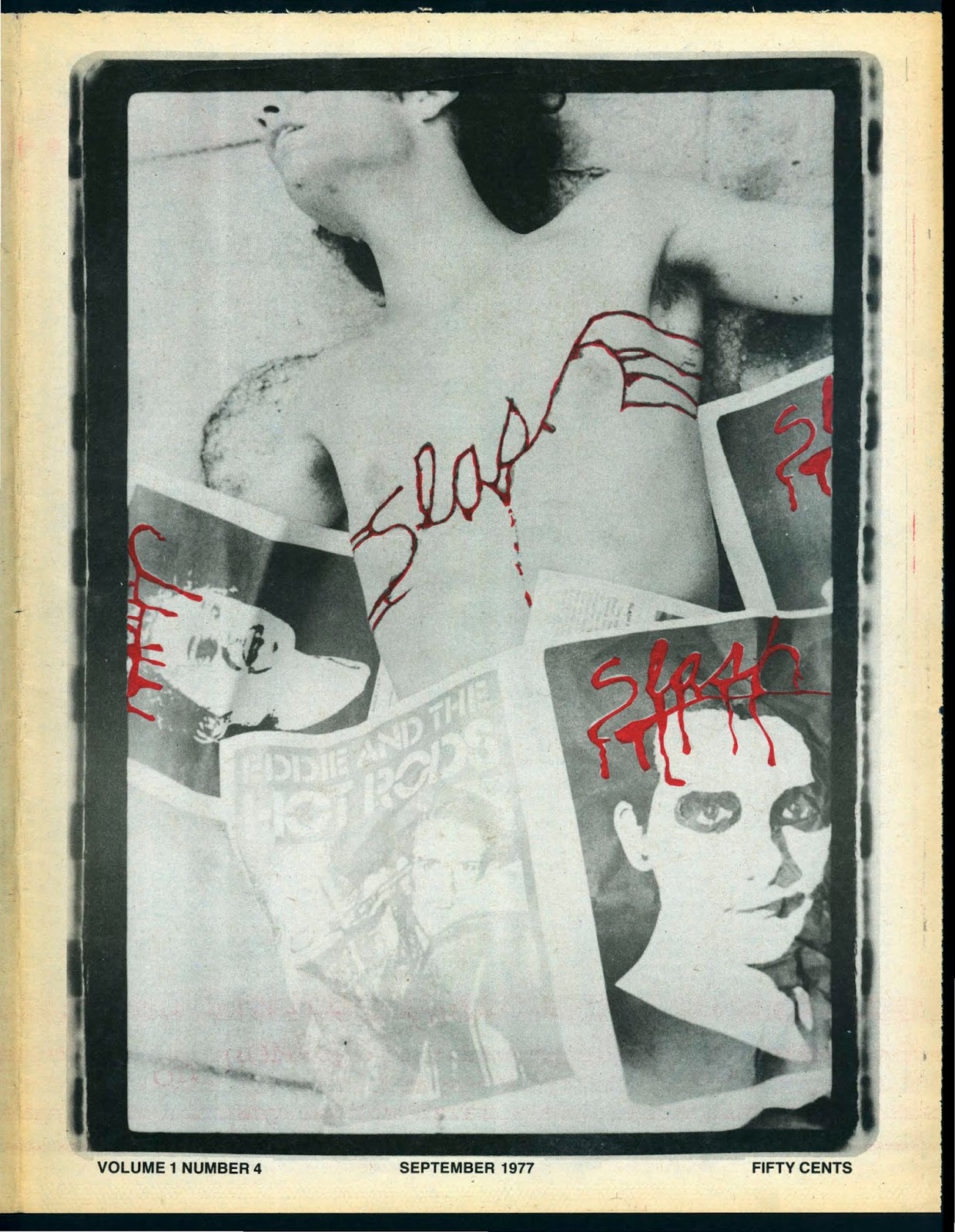
I discovered a very large pdf file containing a massive back catalogue collection of Slash Magazine and No Mag issues. This happened to be a goldmine of really raw, bold graphic design. The front covers used on each issue display a very strong use of type and image. The publication started out with this bloody/gory looking type, which emphasised the 'slash' magazine title. As can be seen below, their front covers changed and developed into using a bold typeface with vibrant background colours.


NO MAG


TONY AREFIN


MIXING MESSAGES; CONTEMPORARY GRAPHIC DESIGN


TYPE & LAYOUT EXPERIMENTS
Since the content for my zine is going to be transforming internet comments into quotes, there's going to be a focus on typography, therefore I want to explore different typeface and be able to manipulate them. There's not going to be any strict type rules within my publication, just a lot of visual experimentations on each page that help exaggerate or illustrate the featured quotation/comment.
This reseach has helped in giving me different ideas to try out for my pages.


RISOGRAPH RESEARCH
As I have set out to print out my zine using a risograph, I've looked into many different risograph printers and studios from the UK. The most well known risograph printers in the UK are Hato Press, Ditto Press, Risotto and Footprint, Who each specialise in different printed formats.
From looking at various examples of risograph zines and prints, I have noticed that a lot of them used the colours pink and blue/black, which appears to be quite trendy. However, these colours stand out to me the most in comparison to the other combinations that I have come across whilst researching, because of the strong contrast. The majority of the risograph work I found to be visually appealing featured large typographic work and illustration, which are both elements that I wanted to explore with my own design. The textures left behind from the risograph printers have a certain charm and quality, which can’t be replicated. Before designing my zine to be risograph printed I need to understand how to set up my design files in order for them to be compatible with risograph printers.


EXAMPLES OF PINK COLOURED RISOGRAPH


HATO PRESS


PICA-POST ZINE
Really loving this small zine that Manchester based clothes shop 'Oi Polloi' have released. Lovely combination of blue monotone images and green paper. The alien looking typeface used is quite appealing when used in this zine format, I don't think that if this font was used on other formats that it would have the same effect because it's far too unusual to be able to communicate anything with a strong message.


A clever little Gif showing the different layers of colour that are printed using Risograph.


No comments:
Post a Comment