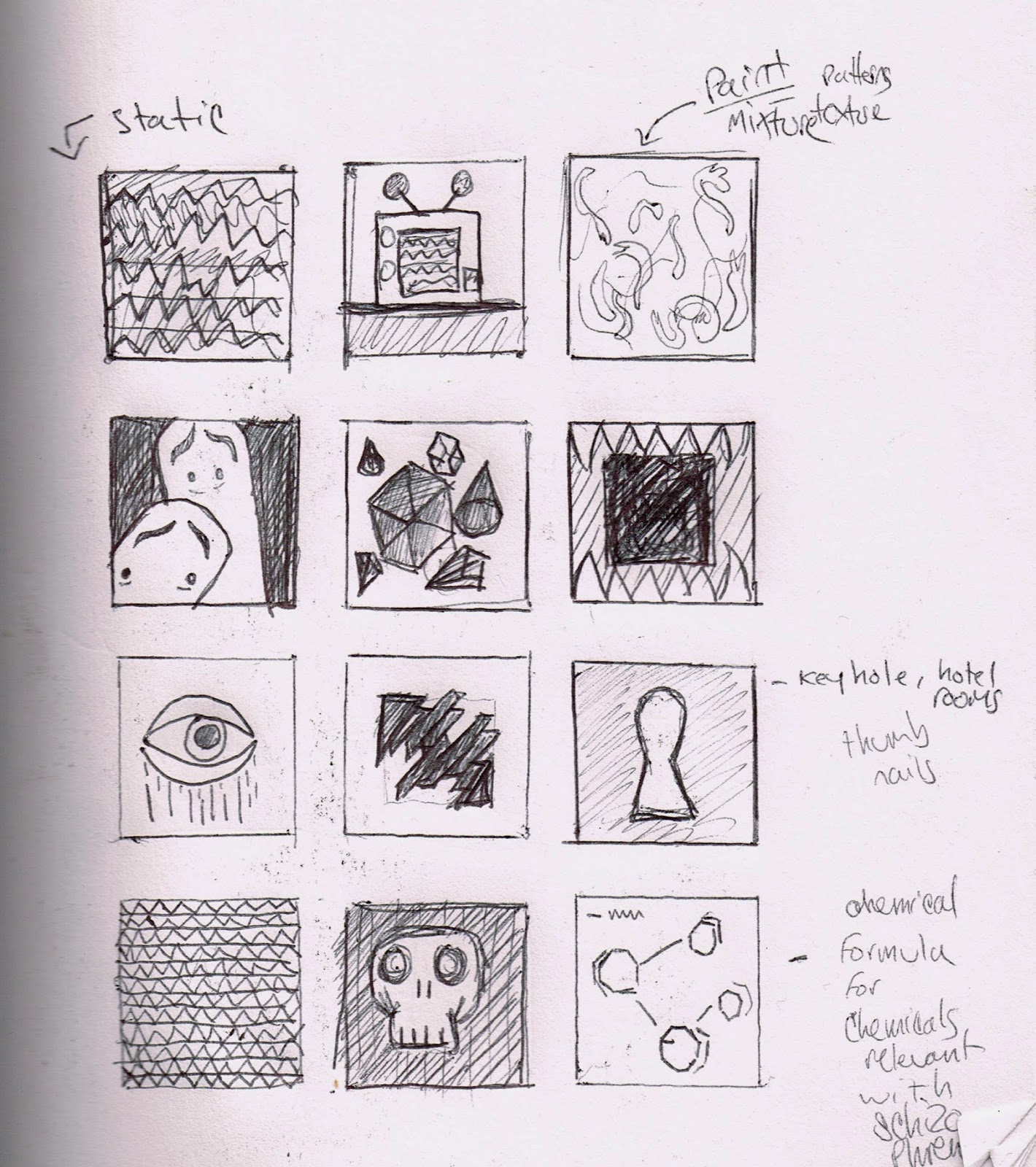
30 Thumbnails produced for my range of ideas

Here are the variations of my concepts and ideas for Fridays Secret 7" interim crit.
The pictures below were taken on my mini fuji instax camera. I was dressed up in a somewhat youth manner and went along to a motorway bridge close by to my halls. This was because my friend Elliot was taking photographs for one of his concepts, of which was based along a similar approach to mine due to the research we took towards the project. He had to chosen Karmacoma aswell and looked into paranoia. He picked out for me to wear my Ralph Lauren polo cap, puffer jacket and Adidas trackies. I took the opportunity of being outfitted as a youth at a grimy location and decided to take a couple of images of myself. The idea behind the adaptation of these images was to make them appear bewildered and crazed. The notion of a different personas. The photo of me directly below makes me looks quite crazed, I dissected my face up on photoshop and shifted the pieces in different directions to try and create an 'unstable', 'conflicted' aura. I did the same process on the other image of me looking more neutral. Throughout this visual experimentation I also added the same photograph on top of each other and enlarged them and added opacity. Although I feel that they link into the idea of confusion and distortion; these images don't strike out as being that effective.


Another concept of which I had planned within the thumbnails was to create an effect similar to multiple exposures in photoshop by over-layering photos and experimenting with the opacity and the layer effects within Photoshop. I asked my flatmate to take photos of me standing inside the hallway because the Karmacoma video and The Shining take place in great big hotels with big elongated hallways. I wanted to create a similar feel with these photos. The overlapping of the photographs are again resembling an obscure state of mind in relevance to Charles Manson and the theme of the Karmacoma video and it's main character, which replicates scenes from The Shining. The set of images below are variations of different opacities on each of the individual layers in photoshop. Slight changes to each of the layers can make the difference in which face is more prominent and can change the mood of the overall image. I made use of the whitespace and placed the images in the centre of the design. In my opinion, this layout draws your eye in to the centre of the image. The white space and the hallway in the background work together.


I was interested in seeing how enlarging/scaling up the layered polaroids would turn out. I wanted the quality of the film to result in showing some grainy textures. Here below are the same images above but cropped & enlarged.


When the image of myself with the open mouth is brought forward within the images it changes to the tone and makes it appear more aggressive and crazed. Without it the imagery comes across as more 'confused' and 'lost'.


Illustration
Another one of my concepts for the interim crit was my use of illustration to portray a confused and morose tone to the record sleeve. This is still in relevance to the notion of schizophrenia and paranoia. It's not a direct link towards it, but the topic of mental illness and health problems isn't the most joyful. I draw these faces throughout my notepads on a day to day basis. I have somewhat created my own signature style within my illustrations of saddened faces and decided to use them for one of the sleeve designs.
This is an inverted crop of the illustrations.


Interim Crit Feedback

People commented on the photos and said that it made the cover design too personal.
I also received a comment saying they were silly. I didn't know what to think to the response on the images to begin with as the use of photography and image was what I was planning on taking further.
I wanted to go further within distortion and glitching to create more interesting textures within the photographs, however what i've realised is that the photographs are not visually pleasing. This brief is almost about how to attract the audience into looking at your design.
I have realised that the illustration concept is my strongest idea so far as the majority of the feedback I received said that it was the most original out of the designs, so I've decided to stick with the idea of my illustrated faces.
No comments:
Post a Comment