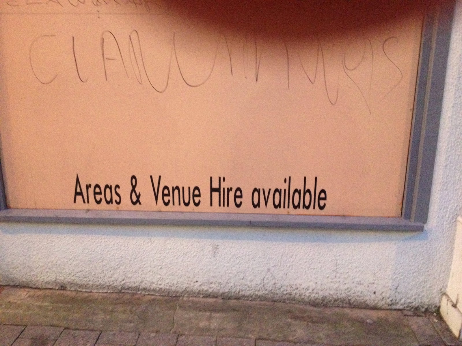
I was walking to the Belgrave music hall in Leeds and around the corner from it, I noticed this stretched text. Well I think it stretched and made to appear more thinner than its original proportions. Either that or they're using a condensed sans serif, perhaps futura. I think it looks absolutely stupid to be honest.


No comments:
Post a Comment