What we had talked about.
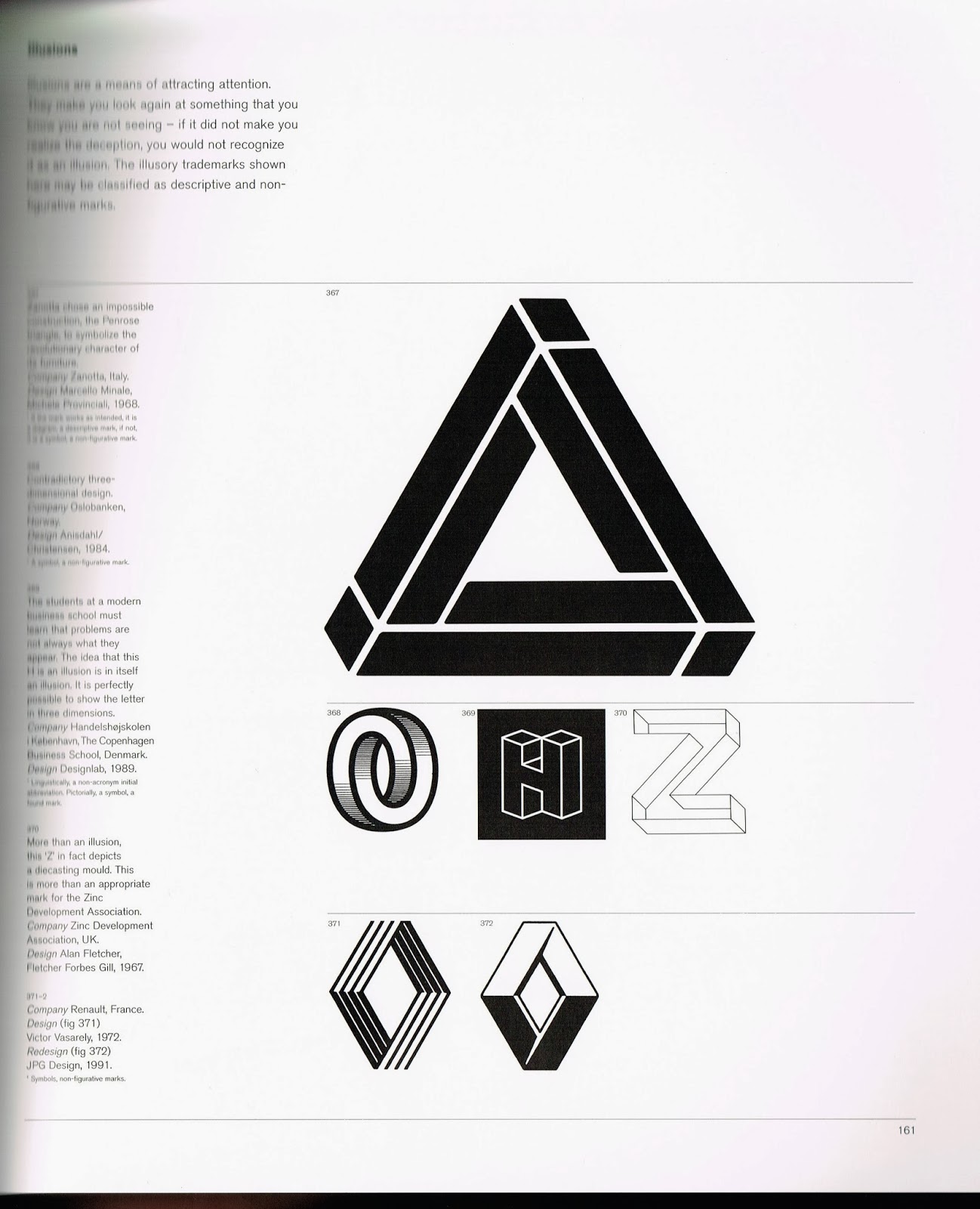
I dived into a couple of my favourite logo, identity and branding books. The following pages are from 'Symbol' by Angus Hyland and Phaidon Press's 'Marks of Excellence'. I wanted the logo to be attractive to the idea and very simple. Geometric shapes, circles and arrows were my main focus for my research as I believe these simple elements would create an effective and clear logo if crafted well enough.
I scanned in these logo designs for British Rail & Swiss Federal Railway as trains are relevant to the topic of transport that out project is based around. Both designs have implemented the use of arrows to communicate direction, distance, movement and travel. Use of arrows is a possibility when it comes to our own logo.
Here is my logo development. I wanted to create something simple and clear with a neutral sans serif. I just used Helvetica as I thought it was suitable for what we wanted to convey as a group.
I showed the crew my designs and we all agreed that this one was the best. I liked this design but all the while when I was creating these logos I was sceptical of how it linked into commuting and movement, as none of them really directly communicated it. However logos don't always necessarily have to display the company/organisations actions, logos are mainly used as emblems for customers/audiences to associate with a brand/company. But looking at it again we all thought that the bottom left and top right corners resembled steps, which could be associated with walking/moving/cities.


No comments:
Post a Comment