Monday, 23 May 2016
Level 6 / OUGD603 / Module Evaluation
Extended Practice has been very challenging on the whole. This module has pushed myself to produce some of my best work to date. This has been a result of the self-initiated projects that I have completed, which helped myself explore areas of design that I've wanted to develop. Artwork for music, event poster designs, a zine and a video were produced in these self initiated briefs, which have ultimately increased my abilities as a graphic designer.
Integrating my interests in music production in Level 6 was what I set out to do at the beginning of the third year and I managed to achieve this throughout three different projects. Being able to enhance my music production skills was really beneficial because it's something I will actively practice after university. However I'm underwhelmed with the amount of production that I contributed to this module, especially since I was planning on releasing multiple beat tapes. These tapes never got round to being finalised and produced due to the first half of the year being taken up by COP. Therefore all design work and music production came to a halt. The latest music I've created has been for my audiovisual project and I'm currently happy with the musical input that was involved. More beats will be involved in the audiovisual project because I will be extending it for the end of year show.
During my time on the course there was been a period where I lost an interest in what was happening in the graphic design world because I had was lacking inspiration. However the Triptych brief that Kieran Walsh introduced and my own Event brief has given me a new direction in graphic design. Poster design, something that I used to consider as mundane has now become a new favourite format to work with because I love how the restrictions of one piece of paper can result in really experimental graphic design as well as strong typographic messages. I've realised where my main interests lie due to the visual experimentations carried out in the poster and zine projects. The Comment Section Zine I created has been my favourite project that I completed as a part of Level 6. Even though the premise of the project is very weird, I believe that the work included in the zine has been my most interesting due to the different design styles I incorporated. My work has started to utilise different design processes and aesthetics by combining them into compositions, which helps generate some really interesting contrasts. The 3D elements I have started to include in my projects are becoming more frequent. This is something I will develop further because I feel that in combination with these others processes that it could make my work become more distinct and recognisable.
I was involved in Several collaborations for my Extended practice and I believe that these projects have been really beneficial in regards to the developmental process. Having an outside perspective at my side definitely improved my decision making skills because working with other people increases your knowledge on the considerations that are needed to be thought about. These collabs have made me ask myself more questions and have enabled me to take more care with design decisions.
As a whole I'm pleased with that I have achieved and how I've developed as a visual artist during extended practice. My independent work ethic has improved over the three years and I'm capable or working on several projects at once. These busy modules have also enabled me to reach final design outcomes much faster as well, which is incredibly valuable for when working with clients as there will always be deadlines that are needed to be met. There are still areas in which I need to improve upon and there are avenues that I have neglected during extended practice, however these will be explored as I start to work within the graphic design industry and on my freelance design practice.
Friday, 20 May 2016
Event Poster Brief
THE BRIEF
Designing an event poster has been an objective of mine for quite some time now and I wanted to use extended practice as an opportunity to pursue this. Since my main interests within graphic design lay within music orientated design I wanted to use this brief as a chance to design a gig event poster.
I'm still surprised that I have never even attempted to create music event posters before this, it's definitely been a long time coming. What must be taken into account with this project is the use of typography because it's the key part of all event design. It's needed to inform the audience of what the event is about, the time, date, location and artists/people involved. For my design I must make sure that all the information that's going to be displayed will be easily digestible for the intended audience.

CONTEMPORARY DESIGN
I've realised that as of late I've become a fan of new age design, which was something that I was not prior to starting my degree here at LCA. Since I've lost myself within Graphic Design I have started to explore these modern day aesthetics and designs, even though I still think that the majority is unoriginal, vapid and lacking in the commitment of sending the appropriate message. I do love the playfulness of contemporary graphic design because it definitely is bound by no rules. Below are a range of images I've sourced from online that display different aesthetics and design techniques of which I'm currently thinking about incorporating with in my poster event design. I'm using this project for myself as an opportunity to start exploring something new that I have never done before. I always look forward to being able to develop my skills with areas of design that I haven't tried out.


Designing an event poster has been an objective of mine for quite some time now and I wanted to use extended practice as an opportunity to pursue this. Since my main interests within graphic design lay within music orientated design I wanted to use this brief as a chance to design a gig event poster.
I'm still surprised that I have never even attempted to create music event posters before this, it's definitely been a long time coming. What must be taken into account with this project is the use of typography because it's the key part of all event design. It's needed to inform the audience of what the event is about, the time, date, location and artists/people involved. For my design I must make sure that all the information that's going to be displayed will be easily digestible for the intended audience.

I've realised that as of late I've become a fan of new age design, which was something that I was not prior to starting my degree here at LCA. Since I've lost myself within Graphic Design I have started to explore these modern day aesthetics and designs, even though I still think that the majority is unoriginal, vapid and lacking in the commitment of sending the appropriate message. I do love the playfulness of contemporary graphic design because it definitely is bound by no rules. Below are a range of images I've sourced from online that display different aesthetics and design techniques of which I'm currently thinking about incorporating with in my poster event design. I'm using this project for myself as an opportunity to start exploring something new that I have never done before. I always look forward to being able to develop my skills with areas of design that I haven't tried out.


SPRAY PAINT
These designs below have used spray paint in them and I think that it's an interesting way of breaking up the layout of a design. It adds a texture and physical element that can't be created digitally. I'm thinking of spray painting my own designs and printing on top of them.


Really love the use of black and white with iridescent colours here. Creating an effective abstract contrast, which catches the attention of the audience very well.


EVENT POSTERS
As I had gathered visual inspiration from looking at different uses of type, layouts and aesthetics on a range of contemporary posters, I needed to hone in on music event posters in order to deliver a successful design. This is because when designing a poster for a gig the type arrangement & hierarchy needs to be correct. If I did a crazy random design with the type and letters everywhere then no one would understand it, thus effecting the sales for the gig. There's a colossal amount of great work out there for music events and the designs i'm frequently looking at are for NTS Radio, Boiler Room, Trilogy Tapes and Young Turks. These record labels and music platforms are very popular with the younger crowd and their associated aesthetics are quite contemporary. From observing the event posters I gained a better understanding in the type layout and hierarchy. The text used for the headlining artist or record label is usually the largest, in order to catch the viewers eyes or inform them that they were the main act. However this isn't always the case as the event location can sometimes be used with the largest type. It definitely varies across different posters, But I feel that the designs are more effective when the type is largest at the top and then gets smaller at the bottom, because this leads yours eyes from the top to bottom of the design, ultimately making you absorb the information displayed. I knew that I wanted to create a poster design for an event that involved either boiler room or NTS radio, mainly because of the DJ's that they host on their lineups. I didn't want to create a poster design for a music event that was going to be playing music I wasn't into. The logos that both of these platforms use are also really cool and recognisable and I wanted to be able to play around with them.


JACK SACHS
Really love the simple 3D work jack sachs creates. His NTS designs are great.


CHOOSING AN EVENT
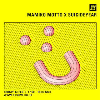
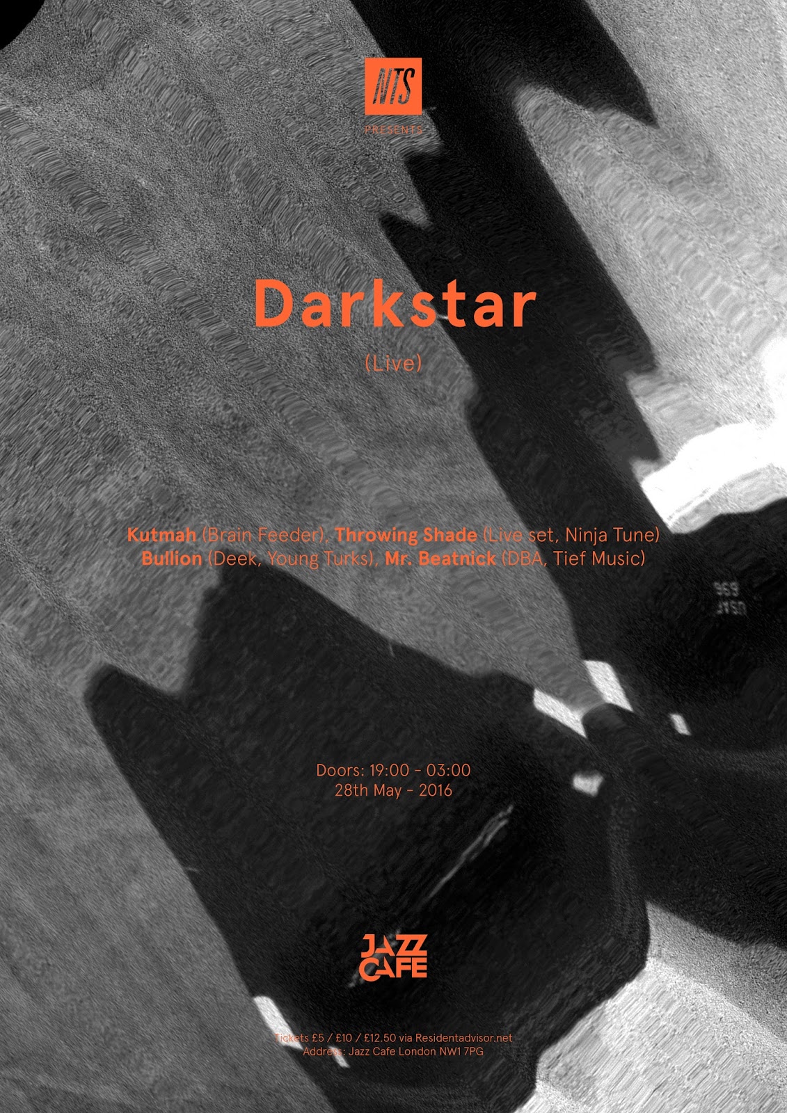
It took me a while to decide on an event that I wanted to design a poster for, especially since there weren't many current events that were going to be happening that had good lineups. I definitely wanted to create something for an event that had not already happened because It's not exciting designing for a past event. I eventually discovered an event that was to be hosted by NTS radio in London. The lineup is solid and the information had already been displayed and designed into a poster and banner. The design already in use was actually pretty decent, but I wasn't not going to design for an event because I liked the existing artwork. Being able to implement the NTS logo into my design got me excited to start designing because I really wanted to experiment with it's placement in my design. Having a logo that people associate with good music events definitely adds some sort of validation to the designs.


I visited darkstar's twitter page and found this design for the event, which was made prior to the one above. It's very basic and was probably made in 10 minutes. They slapped a picture of the DJS in the background and just typed all the information out in one text box most likely.

FAVOURITE EVENT POSTER DESIGNS
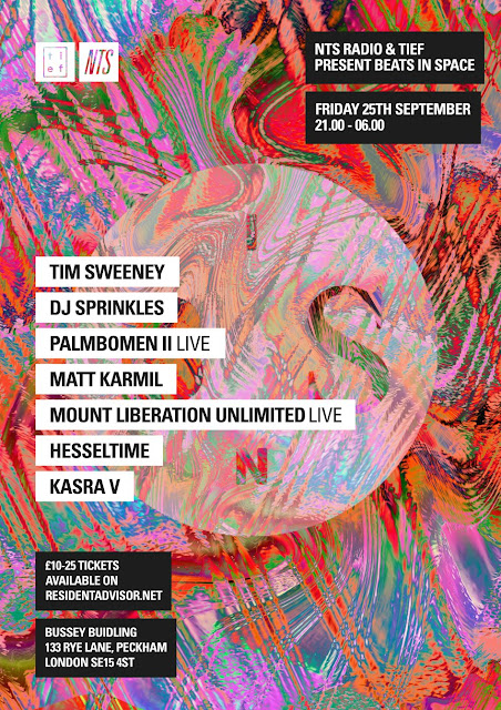
I discovered these beautiful event poster designs when I was looking into different record label events. These designs for Tief Music are incredibly simple and elegant. I love the layout of type and the great use of white space. The artist line up is displayed in the centre of the design and site on top of the square gradient behind it. The arrangement of this design is so appealing and It's definitely given me more of an idea of how I want to display the information that I will be using. The last design here is also another that I love. How the information at the bottom of the poster is grouped in 3's is really cool. It sort of has it's own loose grid on the layout, but it's doesn't come across as being very structured since a lot of the type has been warped/skewed with effects. The playful ness and vibrance of this design is lovely. But the main reason why I'm including it here is because of the combination of Type and Image. The background is a scanned image and I really love the simplicity of posters that can pull of this super common element. It definitely has been a trendy thing to do in design for the last 5 years but I have yet to explore this. I'm aiming to integrate this into my own design.


SPRAY PAINTING
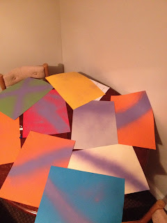
I spray painting various paper stock in advance because once I created my layout design I knew that I wanted to print them over the top of spray paint to see how they would turn out. Since I only had a purple spray can I used that on all of my pieces of paper.


The first thing I did when I started designing my posters was to include all of the required information and logos. This then just leaves me up to a lot of experimentation with layouts, which I will then allow me to whittle them down to the most effective ones. I started off by creating a vector logo for the Jazz Cafe, since there wasn't one on google and I didn't like the standard logo they had. For my design I knew that I wanted the text to be just one solid block colour because all of the poster design that have I found to be successful did this.

LAYOUTS
After I had typed out the appropriate information and placed the vector logos into illustrator I began exploring different layouts. The main things I considered and tested whilst designing these layouts were; Logo placement, using capitals, Block out text, Including the DJ's record labels, the size of the text, underlining the headline act and the placement of the information. Throughout my experiments I only used one typeface, which was Apercu. I knew that in order for my design to present a contemporary aesthetic and to be easily legible that a sans serif was going to be used. I regret not testing other typefaces out, however I really thought Apercu looked strong already when being placed around the document. I realised from my experiments that I didn't want to stick to capital letters because they looked over the top in comparison to the layouts that used lower case letters. The lower case words present a more calm and neutral tone of voice, which I liked. Putting the names of the artists in a column centred within the layout was used but I feel that this way too common and very boring. It also reduces the amount of white space in the composition because all of the central space is used up, I preferred the variations where I used the type in different corners of the page because it made better use of the space.


CHOSEN LAYOUTS
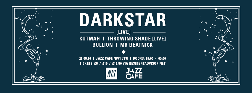
Here are my final chosen layouts that I carried out to use for my final poster designs. I really liked placing the Dj's names in each corner and having the main act in the middle. It helps create a message that tells the audience that these DJ's are playing around the main DJ. Although the layout is a little unconventional and not really that functional. The second layout is influenced from the Tief Music gig posters and I love how I've managed to include a lot of extra space. It makes for a minimal and effective piece of design. I feel that both of these layouts are appealing and would work well if used for real life events. However the one thing I dislike about the layout using the names in the corners is that longer names such as 'throwing shade' can ruin the balance of the composition. Throwing Shade's name doesn't really work in this layout because its too long and invades the space to the right of the Jazz Cafe logo.


I then printed both of the layouts onto the spray painted pieces of paper that I had prepared previously. I wasn't set on using these for my final designs but I was just curious to how they would turn out. I purchased gf smith stock from Fred Aldous and used standard coloured sugar paper. The paper was printed using college's normal studio printers and I love the basic photocopier effect that is overlaid on top. It's not meant to be a pristine and professional poster design and I think the rough textures work really well. They would be cool to hand out for free at an event.


DARKSKY UAV PLANE
I still wanted to experiment with scanned images to use for the design background. However I was really unsure on what images to scan in. I did not want to use any random image because it wouldn't make any sense, not that this brief is deeply conceptual. I just wanted there to be some sort of link within the design. Therefore I started googling 'Darksky' for images of the Electronic Music Duo. Instead of finding images of these producers I came across these pictures of Spy Planes. I then soon discovered that Darksky UAV planes existed and I was really intrigued with their design/shape. Because of the direct link to Darksky who were headlining my chosen event I then decided to scan these images of UAV planes.


Scanned Images


I duotoned the scanned images to achieve a similar effect of the poster design I came across that gave me this idea. Multiple colours were tested and even black and white versions of the scanned images were used too. Out of all the variations I made I preferred the versions with the minimalistic verticle type layout, which helped me whittle the designs down somewhat. I asked for feedback from people in the class and I had a mixed response. Harry said he much preferred the black and white versions, whereas jake liked the green duotones that I implemented. Since I had created so many different colour schemes I knew that I wanted to have a small series that had varying colours so I didn't follow Harry's opinon. But I needed them to all use the same image in the background and I found the most effective one to be the image that had the warped darksky plane. A lot of the designs only had the mountains from one of the pictures I scanned in and it just ruined the connection made with the plane, therefore I kept it consistent and decided to include the planes in all my final designs.


FINAL CHOSEN DESIGNS
Different hues were used on the design with the minimal type layout and darksky uav plane background image. I decided to do this because I wanted to make it consistent, I had produced far too many colour variations and It got me distracted. Including the UAV plane image into the composition helps contribute a reference to the headlining act, which most people won't even realise it's present in the design. However, I'm satisfied knowing that my design does have some relation to the main act. The duotone colour variants in these 5 final posters are all visually pleasing and work well with the white or black text. The posters that use the white text over the image are my favourite because I think that the contrast stands out more than the designs using the black text. But as a collection these posters contribute towards a strong visual piece of work, which I will be using in my portfolio. The paper stock and printing used on my final posters creates a DIY feel and provides texture, which I wanted to present. If I were to create event posters for an event I would hand these printed posters out to people for free or even sell them. This is what Kate Moross did when she was a young graphic designer to be able to get her name out and get recognition. The next step I will take will be to have these printed out on a higher quality paper for my folio and to send these designs to NTS and DARKSTAR. Hopefully they will respond and this could potentially land me some client led work in the future. Being able to design for music related events and record labels is a goal of mine, therefore I aim to contact different promoters and labels to create some opportunities.


Subscribe to:
Comments (Atom)